No products in the cart.

Colourful abstract artists to know right now
Colour can lift a room and sharpen attention in a way few things can. In abstract painting and sculpture, colour is more than decoration. It sets the rhythm of a surface, shapes how a form sits in space, and carries feeling without a single recognisable object. This guide introduces colourful abstract artists whose work rewards slow looking. You will find a mix of established names and vital voices shaping the present, with tips on how to look, where to see work in the UK, and how to choose between originals and editions for your own walls.
How to look at colour in abstraction
Stand back first, then step close. From a distance, a painting’s palette and structure settle into a single impression. Up close, you will notice edges, layers, and small turns of the brush that change how one colour leans into the next. Track contrast. Complementary pairs feel lively. Analogous colours calm the surface. Watch the edges. Hard edges read as graphic. Soft transitions turn spatial and atmospheric. Remember that scale changes meaning. A small square of saturated colour on paper can feel intimate. A wall of colour can reset the mood of a room.
Artists to know right now
The short profiles below are designed for real-world visits and online viewing. Each includes a trusted link for deeper reading.
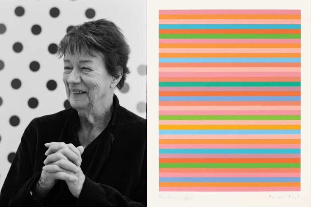
Bridget Riley
Bridget Riley’s colour feels measured and musical. Stripes, curves, discs, and diagonals pulse across large surfaces, testing what the eye can hold while staying clear and precise. Her work is rooted in careful study of colour relationships and perception. The results are not tricks. They are invitations to pay attention to how seeing itself works. Recent displays in London show how a lifetime of looking can keep a language fresh. read more
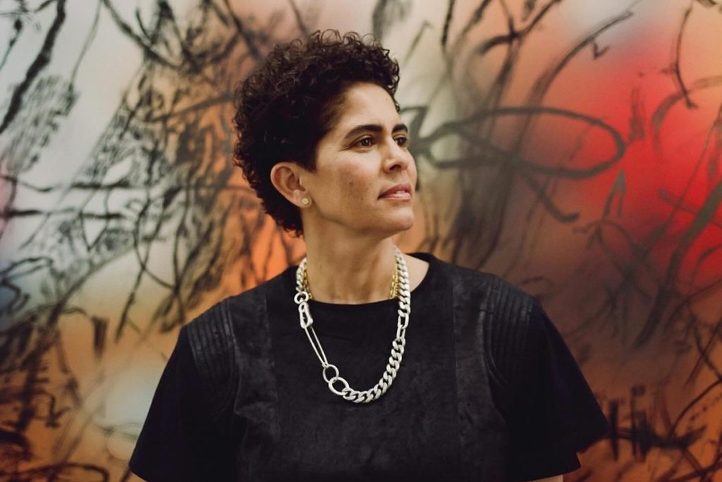
Jadé Fadojutimi
Jadé Fadojutimi’s large canvases are saturated with layered marks, ribbons of colour, and gestures that resolve into luminous fields. The work sits between drawing and painting. Transparent passages recall memory or sound, then solid strokes snap the composition into the present. Her paintings reward repeat visits because forms seem to shift with each viewing. Visit her website
Julie Mehretu
Julie Mehretu builds complex, multi-layered abstractions that carry traces of maps, architecture, and the movement of people. Thin lines overlay sprayed veils of colour, then dense marks accumulate until the surface hums. These are paintings that feel like cities or weather. The scale is often monumental, which makes the work ideal to experience in person.
Katharina Grosse
Katharina Grosse expands abstraction into space. She uses sprayed colour on canvas, soil, and architecture, converting rooms and objects into sculptural painting. Saturated hues collide and drift. You can walk around and through them, which turns viewing into an event. Her studio paintings show the same energy in a portable form.
Stanley Whitney
Stanley Whitney’s grids of colour are simple to describe and deep to look at. Stacked blocks nudge against each other in a hand-drawn matrix. The pleasure is in the tuning. Warm fields lean into cool neighbours. Narrow bands stabilise wide ones. The paintings feel musical because sequence and pause matter as much as the notes.
Howardena Pindell
Howardena Pindell’s abstract works often begin with process. She cuts, punches, sprinkles, layers, and paints, building richly textured surfaces that shimmer with small fields of colour. The patient labour of making sits next to sharp ideas about memory, time, and social history. Up close, the surfaces feel almost textile. From a distance, they read as colour and light.
Odili Donald Odita
Odili Donald Odita paints colour as movement, rhythm, and community. His murals and canvases use angled bands and carefully tuned palettes to create energy across a wall. In recent projects he has anchored sections of colour to songs or ideas about gathering, which brings sound and social life into the act of looking.
Rana Begum
Rana Begum moves between sculpture, relief, and painting. Folded metal, sprayed colour, and light turn simple geometry into shifting experiences. Walk past a work and the colour changes. Stand still and edges seem to float. The practicality is part of the beauty. These works function with daylight as an active material, which makes them perfect for public space and modern interiors.
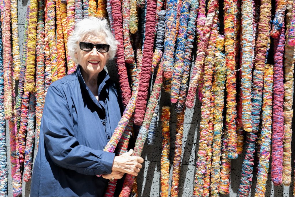
Sheila Hicks
Sheila Hicks uses fibre as a primary material for abstraction. Twisted skeins, cords, and woven forms gather into intense colour fields that hang, drape, and sit in space. Textile has weight and warmth. Hicks uses both to create works that feel architectural and alive. The colour is rarely flat. It is built from strands that catch light differently across a surface.
Etel Adnan
Etel Adnan’s small canvases compress a lifetime of looking into clear shapes and vivid colour. Squares, hills, suns, and bands become concentrated moments of place. A lemon circle can feel like a warm afternoon. A block of ultramarine carries the weight of sea or sky. Though Adnan died in 2021, recent museum displays keep her influence present in contemporary abstraction.
David Batchelor
David Batchelor’s work explores colour in the city. Plastics, light boxes, and found industrial materials are tuned into compositions that celebrate synthetic colour. His writing on colour is widely read, which gives the practice a useful critical frame. The sculptures are generous to viewers who encounter them outside museums because they feel familiar and strange at the same time.
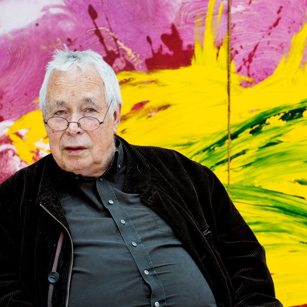
Howard Hodgkin
Howard Hodgkin’s paintings are saturated, layered, and often painted on wood that includes the frame as part of the object. Brushstrokes sweep and curl, creating a sense of warmth and memory. Though not strictly non-objective, they are an essential part of how colour operates in British abstraction. Hodgkin’s prints also show how colour can glow on paper.
Styles within colourful abstraction
Abstract art is a wide field. A few anchors help to organise what you see.
Colour field
Large, flat areas of saturated colour set mood through proportion and edge. Think of the way a single orange panel can warm an entire wall or how a large blue rectangle can quiet a space.
Hard edge geometry
Crisp shapes and clean boundaries. These works read across a room and reward close looking as variations in spacing and proportion become clear.
Lyrical and gestural painting
Swept brushwork and layered washes create a sense of movement and time. The colours blend optically as the eye crosses the surface.
Optical play
Grids and stripes create vibration and flicker. The effect depends on precise tuning of neighbouring colours and intervals.
Collage and textile
Paper, fabric, and fibre bring texture and structure to colour. Shadows and surface catch light in ways that paint alone cannot.
Materials and studio methods
Acrylic paints dry fast and hold brilliant colour. Oil allows slow blending and glazed depth. Gouache and watercolour on paper give matte fields with crisp edges. Pastel and pencil sit on top of painted fields, adding line and grain. Spray paint can turn a wall into a colour atmosphere. Textile and fibre introduce warmth and weight. Many artists move between materials because each carries colour differently.
Where to see colourful abstraction in the UK
Start with the national collections, then build trips around regional programmes.
Tate Modern, London
Collections and changing displays of modern and contemporary abstraction, including artists in this guide.
https://www.tate.org.uk/visit/tate-modern
Tate Britain, London
Displays of modern and contemporary British abstraction, including Bridget Riley and related contexts.
https://www.tate.org.uk/visit/tate-britain
Hayward Gallery, London
A programme that often foregrounds colour, installation, and material experimentation.
https://www.southbankcentre.co.uk/venues/hayward-gallery
Whitechapel Gallery, London
Historic and current exhibitions that frame abstraction within wider contemporary practice.
https://www.whitechapelgallery.org/
Baltic, Gateshead
Large galleries suited to ambitious, colour rich installations and survey shows.
https://baltic.art/
Arnolfini, Bristol
Contemporary programme where colour and form often intersect with performance and film.
https://arnolfini.org.uk/
Fruitmarket, Edinburgh
Exhibitions and commissions that showcase materials and process with strong educational support.
https://www.fruitmarket.co.uk/
Prints, editions, and originals
Original works carry the energy of their making. Thick paint catches light in ways that a reproduction cannot. Works on paper bring immediacy and often better value. Limited edition prints, such as giclée on cotton rag, offer longevity and accurate colour at a more approachable price. Open edition poster prints are useful for testing palettes and arrangements at home. Canvas prints remove glare and suit softer interiors. Metal prints suit kitchens and hallways where durability matters. When buying editions, look for clear details about paper, ink, edition size, and a certificate of authenticity.
How to choose for your space
Measure the wall and plan scale before you fall for a piece that is either too small or overpowering. As a rule of thumb, aim for artwork that spans about two thirds of the furniture width beneath it. For a gallery wall, combine one anchor piece with smaller works and keep gaps consistent. Consider light. In bright rooms, use non reflective glazing or canvas to reduce glare. Think about humidity for kitchens and bathrooms. Metal prints and well-sealed frames are easier to maintain where moisture is present.
Buying checklist
Title and process
Is the method clear. For example acrylic on canvas, oil on panel, or giclée on cotton rag.
Paper and inks
For editions, look for named papers and archival pigment inks.
Edition details
Open edition or limited. If limited, how many, how signed, and is there a certificate.
Size and frame
Check image size versus paper size, and confirm whether framing and glazing are included.
Condition and care
Ask about display advice and cleaning. Keep receipts and certificates together.
Case studies for seeing in person
Bridget Riley at Tate Britain
A focused display shows how carefully tuned colour can turn static shapes into lived time. The change is not only in your eyes. It is in your body as you adjust to the movement across the canvas.
Odili Donald Odita at MoMA
A lobby installation built from angled bands of colour that sweep across columns and walls. Each section is anchored by a piece of music, which adds another way to understand the flow.
Rana Begum
Recent UK displays show how folded metal and sprayed colour change with your movement through space. Position yourself at different angles to see light and shadow flip the palette.
Frequently asked questions
What makes a painting abstract
Abstraction removes direct representation. Colour, line, rhythm, and texture carry the meaning. Some works hint at place or figure while staying non-representational.
How do I begin to collect colour focused abstraction
Start with works on paper or limited editions from trusted galleries. Frame well, measure carefully, and build a collection around a palette you enjoy living with.
Is bigger always better
Large canvases command a wall. Small works on paper can hold a room if the colour is tuned well and the frame is considered. Use scale to set mood.
How should I light colourful work
Indirect daylight is ideal. If you add spotlights, angle them to reduce glare and choose warm to neutral bulbs. Aim for even light across the surface.
Do prints hold value
Value depends on the artist, demand, and edition size. A well made edition on good paper will look excellent for years. For investment thinking, buy the strongest work you can afford and plan to live with it.
A short glossary
Abstract painting
Art that does not depict a specific object or scene. Colour, form, and texture create meaning.
Colour field
Large, flat areas of colour that set mood through proportion and edge.
Hard edge
Crisp boundaries between colours that read clearly across a room.
Gestural
Visible brushwork and movement on the surface.
Saturation
Intensity of a colour.
Palette
The set of colours an artist uses.
Impasto
Thick paint that stands up from the surface.
Giclée
Archival inkjet printing on fine art paper.
Colour in abstraction is not a trend. It is a language that artists keep refining because it speaks directly to how we sense the world. Spend time with a few pieces in person. Notice which palettes you keep returning to. Choose one strong work that sets the tone for a room, then build slowly. Whether you respond to the precision of Bridget Riley, the layered atmospheres of Julie Mehretu, the spatial colour of Rana Begum, or the grounded grids of Stanley Whitney, the path through colourful abstraction begins by paying attention.
Leave a Reply