No products in the cart.
Contrast in Art: How Light, Colour and Texture Build Drama
Contrast
At its heart, contrast is about placing differences side by side so that each becomes more powerful in relation to the other. A bright highlight becomes more dazzling when set against darkness, just as a soft brushstroke feels more delicate when placed next to something jagged. These differences are what guide the viewer’s eye, create a focal point, and build a sense of movement within the work.
Across art history, makers have used contrast to bring ideas to life. The sections below show how light, colour and texture can work together to build drama and meaning, and how thoughtful choices change not only how a work looks, but also how it feels.
Types of Contrast and Their Impact
Contrast is the art of difference. Used well, it helps you create a focal point, add depth, and guide the viewer’s eye through a picture. Below are four practical kinds of contrast you can use, with simple cues on when and why they work.
Rembrandt, Self-Portrait, 1659. Face lit against deep shadow shows value jumps with clear modelling.
Value contrast
Value means how light or dark something is. Strong value contrast is the quickest way to build drama. Place a bright highlight beside a deep shadow and the highlight will pop. Painters use this to carve form, separate foreground from background, and lead the eye to the centre of interest. You can plan value contrast with quick black and white thumbnail studies before adding colour. Think about the whole range, not just extremes, so the final image has enough mid-tones to feel believable while still striking.

Colour contrast
Pair colours that sit opposite each other on the colour wheel, such as red with green or blue with orange, and you get instant visual tension. Complementary pairs can be loud or subtle depending on saturation. High-chroma complements feel urgent and energetic. Muted complements feel sophisticated yet still lively. You can soften the clash by shifting one hue slightly, or by using tints and shades. A limited palette that includes a single complementary accent can be very effective.

Texture contrast
Smooth against rough, glossy beside matte, thick impasto next to thin glaze. Texture contrast makes a surface feel alive and creates a sense of movement. It also helps separate materials and forms. Reserve your richest textures for key areas so they act like magnets for the eye, and keep quieter passages around them to let those textures breathe.

Limited palette versus high contrast
A limited palette can intensify drama because every small change carries weight. With fewer hues, value steps and edge quality do more of the work, and tiny colour shifts read clearly. If you prefer a broader palette, keep one family of colours dominant, add a single complementary accent, and plan your value ladder first. A quick recipe helps: mix a five step greyscale, place your highest jump where the story sits, then fit colours to those steps so the scene stays readable.
How Artists Create Focal Points Through Contrast
A strong focal point is not an accident. Artists place contrasts with care so the eye lands where the story begins, then travels through the rest of the image in a clear order.
Value placement
Our eyes jump to the area of highest value contrast first. A bright shape against a dark field, or a shadow pressed up against a light shape, creates instant emphasis. Put your strongest light beside your deepest dark where you want attention. Soften value steps elsewhere so that secondary areas feel quieter.

Colour and saturation
Colour contrast can lead the eye just as effectively as value. Complementary pairs, such as red with green or blue with orange, build tension and help a subject stand forward. Saturation matters too. A small patch of pure, saturated colour will dominate a large area of muted colour. Keep most colours slightly neutral and reserve the richest note for the focal area.

Size, isolation and spacing
Bigger is not always better, but a scale jump is powerful. A single large shape among smaller neighbours becomes a natural focal point. Isolation works the same way. Give the main subject a little breathing room and crowd the supporting shapes. The space around a subject can be as persuasive as the subject itself.

Edge quality and detail
Hard edges pull focus. Soft or lost edges release it. Place crisp edges and fine detail where you want the viewer to linger. Let non-essential areas dissolve into softer transitions. This simple switch creates a clear hierarchy without shouting.

Texture and surface contrast
Thick impasto set beside thin washes, glossy next to matte, rough against smooth. These contrasts add tactile interest and can anchor the focal point. Concentrate the richest textures near the centre of interest and simplify textures elsewhere to avoid visual noise.

Designing movement or stillness
Contrast can create a sense of movement when arranged in a path. Step value contrasts and colour accents so they arc through the image, like stepping stones for the eye. If you need calm, consolidate contrasts into one area and keep the rest close in value and hue. Rhythm comes from repeating contrasts in smaller doses, leading the viewer without confusion.

Practical planning
Test your idea with quick black and white thumbnails to map value contrast. Squint at your work to check that the focal point still reads. Limit the number of competing accents. If everything shouts, nothing stands out.
Classic Examples of Contrast in Practice
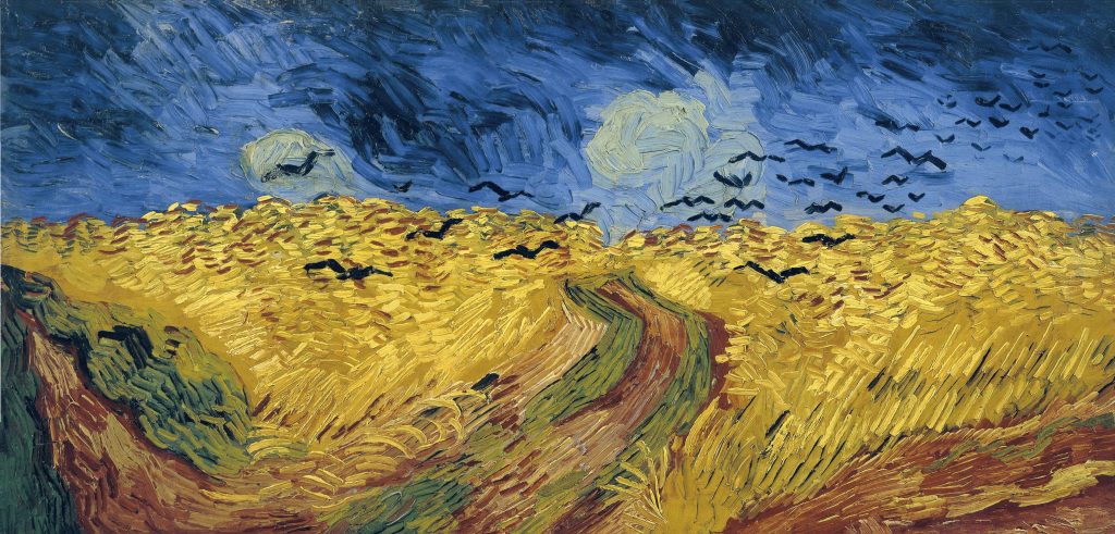
Vincent van Gogh, Wheat Field with Crows
Painted in 1890 at Auvers, now in the Van Gogh Museum in Amsterdam, this canvas sets a saturated yellow field against a turbulent blue sky, with a dark path cutting into the distance and crows slicing across the view. The high value jump between sky and land, along with the blue and yellow complement, creates immediate tension. Thick, directional strokes add texture contrast so the field seems to ripple, and the angled marks pull the eye along the path into the unsettled space.
Vincent van Gogh, The Night Café
Made in 1888 and now at the Yale University Art Gallery, this interior pits acidic reds against heavy greens to create unease. Pools of yellow light push the value contrast on the walls and ceiling, while the receding boards and the sharp edges of the billiard table drive the eye into the room. Here colour contrast carries the mood, and value contrast locks the structure in place.

Contrast Through Light and Texture
Chiaroscuro, modelling with light and dark
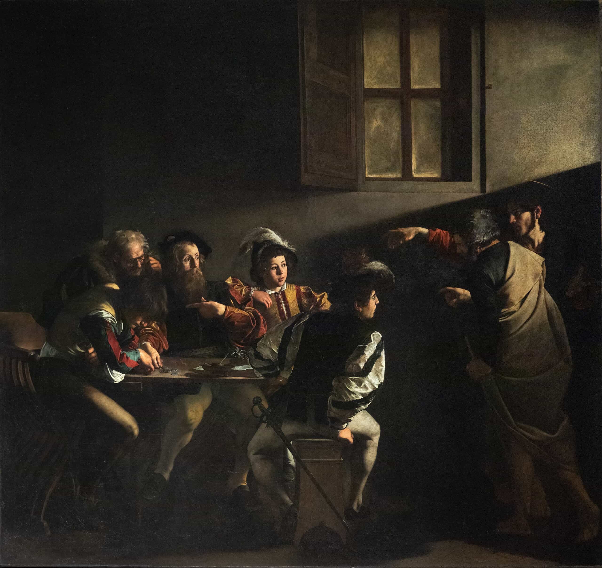
Chiaroscuro uses strong light and dark to describe form and set mood. Caravaggio often staged figures under a single, high contrast light so forms emerge from deep shadow, as in The Calling of Saint Matthew from about 1599 to 1600 in San Luigi dei Francesi, Rome. Rembrandt preferred more gradual shifts, letting faces glow from darkness to focus attention, a quality visible in The Night Watch of 1642 at the Rijksmuseum.
Planning value first keeps paintings readable at a distance. Squint to see the major shapes, or sketch a quick black and white notan before committing to colour. In portraits and figure studies, soften shadow edges away from the focal point and sharpen them near the core light to add depth. In landscapes, set a bright sky against a darker landform, or reverse it at sunset, to give the scene structure and space.
Texture that catches the light
Texture contrast adds a second layer of drama. Thick impasto builds real highlights and shadows on the surface so the painting reacts to light in the room. Van Gogh used loaded strokes that stand proud from the canvas, turning light into tiny glints across the paint skin. You can reserve this rich texture for focal areas and keep surrounding passages thinner and smoother, which increases the tactile pull where it matters most.
Beyond brushwork, contrast glossy varnish with matte passages, or pair smooth glazes with scumbled, broken colour to suggest atmosphere and movement. In watercolour, granulating pigments and drybrush over cold-press paper create lively roughness next to calm washes. In oils or acrylics, a palette knife can lay in crisp planes that pop against soft, brushed areas.
Putting light and texture to work
Decide where the highest value contrast will sit, then reinforce that area with the richest texture. Keep competing zones quieter by narrowing value steps and smoothing surfaces. If everything sparkles, nothing stands out. A few well-placed thick strokes can be more effective than a uniformly impasto surface. Conversely, if you want calm, keep values close and textures restrained so the eye drifts rather than snaps to attention.

Composition: Harmony Balanced by Contrast
Great compositions feel coherent even when they contain bold differences. The trick is to let harmony carry the overall mood while using moments of contrast as accents. Think of harmony as the background chord and contrast as the solo. If every element competes, the eye tires. If nothing stands out, the piece feels flat.
Start by choosing a dominant quality. That might be a narrow value range, a family of related hues, or mostly soft edges. Then place a small number of intentional contrasts to create a focal point and a clear path through the picture. Rhythm helps here. Repeat a contrasted element in smaller doses so the eye moves from one beat to the next. Spacing also matters. Give the focal area a little room so it can breathe, and cluster supporting elements where you want quieter activity. Repetition, variation and rest points work together to keep viewers engaged without overwhelming them.
A simple check is to squint or step back. Does one area clearly lead, with others supporting it. Do contrasts taper as the eye moves away from the centre of interest. If yes, harmony and drama are doing their jobs side by side.
Practical Tips for Artists and Enthusiasts
Use the colour wheel
Pick complementary pairs such as red with green or blue with orange to create instant tension. Adjust saturation to control the mood. High saturation feels urgent, muted complements feel refined. A tiny accent of the complement in a mostly unified palette can be very effective.
Start with a limited palette
Restrict yourself to two or three colours plus white, and explore value first. A limited palette forces clearer decisions and makes any later contrast more meaningful.
Plan values with notan
Make quick black and white studies to map light and dark. Decide where the highest contrast will live, then keep surrounding areas closer in value so the focal point reads from across the room.
Guide the eye with edges and texture
Use harder edges, higher saturation and thicker texture where you want attention. Keep edges softer, colour duller and paint thinner elsewhere. Pair smooth washes with small areas of impasto or scumbled paint to add lift without noise.
Stage contrasts, do not sprinkle them
Choose one primary contrast and one secondary. Everything else should support those choices. If every area shouts, nothing stands out.
Evaluate at a distance
Step back or view the work in greyscale on your phone. If the focal point still reads, your contrasts are working.
Drama Through Difference
Contrast is the heartbeat of visual storytelling. When artists set light against dark, cool beside warm, or smooth next to rough, they build drama, direct attention, and add depth. Value contrast shapes form and carves space. Colour contrast creates mood and tension. Texture contrast brings surfaces to life and invites the viewer to linger. Used with care, these differences create a clear hierarchy so the eye knows where to look first, then where to travel next.
Look closely at the art around you and you will start to see these choices everywhere. A bright bar of light in a dim pub interior, a slice of orange beside a field of blue, a patch of thick paint catching the gallery lights next to a calm, flat wash. These contrasts act like signposts, giving pictures energy, clarity and emotional weight in ways you can feel before you can name them.
Whether you are painting, drawing, photographing, or simply enjoying a visit to a gallery, try a quick experiment. Squint to simplify the scene into light and dark. Check which colours carry the strongest pull. Notice where edges are sharp and where they drift. These small observations will sharpen your eye and, if you are making work yourself, help you design images that hold attention and feel complete.
Leave a Reply