No products in the cart.

Different Types of Paintings and How to Pick the Right One
Walk into a gallery and it is easy to feel slightly overwhelmed. Oil paintings, acrylic abstracts, delicate watercolours, mixed media on paper, giant canvases that fill a wall. If you are not sure where to start, it can feel safer to walk on than to choose.
You do not need to be an expert to choose paintings well. You just need to understand what different types of paintings actually are, how they behave over time, and how they might fit into your life. Once that clicks, you can trust your own taste instead of second guessing it.
This guide will walk through different types of paintings by medium, by style and by how they sit in a room. Then we will look at how to pick the right painting for your space, your budget and the way you live.
What we really mean by “types of paintings”
People often talk about painting types as if they are a tidy list. Oil. Acrylic. Watercolour. Abstract. Realistic. In practice, most paintings sit at the overlap of three things.
First, medium. What the paint is made of and what it is painted on. Oil on canvas behaves differently from watercolour on paper or ink on board.
Second, style. What the painting looks like and how it is handled. A figurative portrait, a landscape, a seascape, a hard edged geometric abstract, a loose expressionist canvas.
Third, role. Where the painting will live and what you want it to do. An intimate work for a bedroom is not the same as a bold focal point above a sofa or reception desk.
When you look at a painting, try to keep those three questions in mind. What is this made from. How is it painted. Where could it live.
Types of paintings by medium
Medium is a solid place to start. It is not about right and wrong. It is about understanding how a painting was made and what that means for you as a collector.

Oil paintings
Oil paint mixes pigment with oil, most often linseed. It dries slowly, which lets the painter blend colours and work wet into wet for longer. That slow drying is why so many traditional paintings have such soft transitions and rich surfaces.
Oil paintings tend to feel substantial. The colours can be deep and complex. The surface can range from smooth glazes to thick, sculptural brush marks. When you stand close, you often see small decisions that are not obvious in reproduction. A shift of temperature in a shadow, a scratched line, a transparent glaze over an earlier layer.
In the home, oil paintings like a fairly stable environment. They do not enjoy damp, strong heat or harsh direct sunlight. Normal modern interiors are usually fine. They benefit from the same common sense you would give books or wooden furniture. No radiators directly below, no bathrooms full of steam, no constant glare.
If you enjoy traditional figurative work, atmospheric landscapes or textured contemporary painting, many of the pieces you are drawn to will be in oil.

Acrylic paintings
Acrylic paint is water based while it is wet and becomes tough and flexible once it dries. It dries much faster than oil, which makes it popular with contemporary painters. Layers can be built in a single session. The paint can be kept very flat and graphic or pushed into heavy impasto.
Because acrylic can mimic other media, it is one of the most adaptable options. Some acrylic paintings look almost like oils at first glance. Others resemble watercolour, ink wash or printmaking. Some artists combine acrylic with collage and drawing to create mixed media paintings with a lot of depth.
In a domestic setting, acrylic paintings are generally robust. Once the paint has cured, it tends to cope well with ordinary fluctuations of temperature and humidity. As with any work on canvas or panel, you still want to avoid extremes and prolonged direct sun.
If your eye is drawn to bold colour, sharp edged shapes or contemporary abstract work, there is a good chance you are looking at acrylic painting even if the label does not shout about it.

Watercolour paintings
Watercolour has a reputation for being polite and genteel. That is only one side of it. At its core, watercolour is pigment and water on paper, and that combination can be as punchy or as subtle as the artist wishes.
The key thing to notice with watercolour is that the paper is active. The white you see in a highlight is the untouched surface, not a later addition of white paint. Layers of transparent colour sit one over another. Where they cross, you see new colours appear. Edges can be crisp, where the artist has worked on dry paper, or soft, where paint has flowed into wet fibres.
Watercolour paintings need a bit more care in display. They should be framed behind glass or acrylic with a mount, so the paper never touches the glazing. The frame should be well sealed at the back. Avoid hanging them in steamy rooms or in spots where strong sunshine hits the wall every day. In return, you get a kind of intimacy that is hard to match. Watercolour draws you in close. It rewards that quiet, private viewing distance.
For bedrooms, studies, corridors and smaller spaces where you might pass close by, watercolour and other works on paper work beautifully.

Gouache, ink and other water based paints
Gouache is a cousin of watercolour. It uses similar ingredients but has more body and covers more opaquely. It allows artists to correct and overpaint in a way that traditional watercolour does not. The result can look like a flat, velvety layer of colour with a fine matte finish.
Ink, whether brushed or drawn, often appears in works that sit between drawing and painting. Large ink pieces can feel as dramatic as any canvas. They rely on line and tone rather than thick texture.
Gouache and ink paintings are usually on paper or card. They share many of the same needs as watercolours in terms of framing and care. They suit people who like graphic clarity, strong silhouettes and visible decision making.

Mixed media and collage based paintings
Many contemporary painters are not loyal to one medium. They might combine acrylic, spray paint, oil stick, collage, graphite, pastel, printed text and found images in a single work. These are often described as mixed media paintings because paint is still doing much of the work, even if other materials are present.
These paintings can feel very rich. Layers of paper and paint recall walls built up by posters and graffiti. Little fragments of text or photography appear and lose themselves again in the surface.
Mixed media paintings can be on canvas, wood or heavy paper. It is worth asking a gallery how a particular work should be framed and whether any elements are especially sensitive to light. When handled well, they are some of the most rewarding works to live with, because you keep discovering new details over time.

Types of paintings by style
Medium tells you what something is made of. Style tells you how that material has been used. You do not need to pin labels on every painting, but a few broad categories are helpful.
Figurative and representational painting
Figurative painting covers any work that shows recognisable things. People, animals, interiors, still life, city streets, domestic scenes. Within figurative work, the range is huge.
At one end are highly realistic paintings that could almost be mistaken for photographs, though the best of them still feel different from a camera image. At the other end are loose, sketch like paintings where the subject is clear but the handling is suggestive rather than exact.
Figurative paintings are often the first type that new buyers gravitate towards. They are easy to understand on one level, because you can name what you see. Beyond that first impression, the way an artist uses colour, composition and gesture can carry all sorts of other meanings.
A portrait can be flattering or brutally honest. A painting of a kitchen table can feel warm, lonely, nostalgic or tense depending on the choices the painter has made. When you are choosing, pay attention to how a figurative work makes you feel, not just whether you recognise the subject.
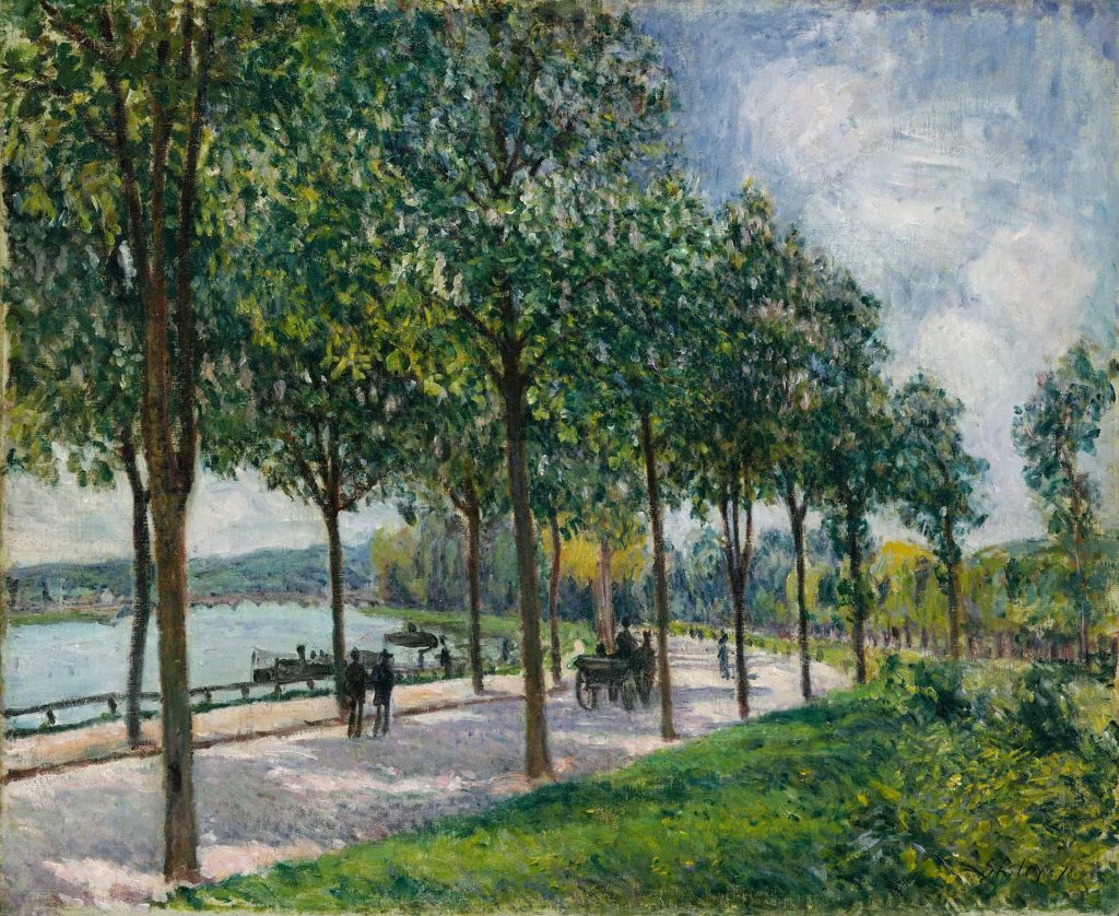
Landscape and seascape painting
Landscape painting focuses on place. Hills, fields, rivers, forests, city skylines, industrial sites. Seascape painting focuses on the coast and the sea in all its moods.
Traditional landscape paintings often follow a recognisable structure. A foreground that leads your eye into the scene, a middle distance that carries your gaze, and a horizon that holds everything together. Many contemporary landscapes loosen that structure and concentrate instead on light, weather or atmosphere.
Landscape and seascape paintings are popular because they bring a sense of space into a room. A small room with a deep, distant view on the wall feels different from a small room with only flat, close subjects. Coastal paintings in particular can be very grounding. They remind you of wider horizons even when you are in the middle of a town.
When choosing a landscape, ask yourself whether you want a specific place that means something to you, or whether you are more interested in a general mood. A painting of a particular bay may bring back memories every time you see it. A more atmospheric landscape might be easier to live with if you plan to rearrange rooms and furniture over time.

Abstract painting
Abstract paintings do not show recognisable scenes. They work with colour, shape, texture and rhythm. They can be quiet or loud, geometric or organic, neat or wild.
For some people abstract painting is the most difficult type to approach. There is no obvious story. There are no figures to empathise with. The trick is to let go of the idea that you have to decode a message and treat the painting more like music. Does it feel calm. Does it feel tense. Does it feel busy or spacious. Do you feel yourself breathing differently in front of it.
Abstract paintings are very adaptable in interiors. Because they do not tie you to a particular subject, they can sit happily with different furniture and decorative changes over the years. A good abstract painting will stand up to long looking. You should be able to come back to it day after day and still find new relationships between areas of colour or mark.
If you enjoy pattern, textiles, maps or aerial views on screens, you may already be more comfortable with abstraction than you realise.

Minimal and quiet painting
Minimal paintings limit themselves deliberately. They might use only a small range of colours, a simple motif, or a restrained set of marks. At first glance they can seem plain. With time, they reveal subtler pleasures.
These works often depend on exact choices. The difference between two whites, or between a slightly warm grey and a slightly cool grey, can be enough to change the whole mood. Edges matter. Surfaces matter. When you stand in front of a minimal painting, it can feel like a calm interruption of whatever else is going on around you.
Minimal paintings can be wonderful in bedrooms, studies and quiet parts of a house. They do not shout. They give you a point of focus when you need calm.

Expressionist and gestural painting
Expressionist paintings are full of energy. You see the physical movement of the painter in the brushmarks, drips, scrapes and smears. Colour may be strong and sometimes deliberately clashing. Bodies and objects can be distorted, not as mistakes but as a way to show feeling.
At their best, gestural paintings feel alive. You can almost reconstruct the order in which marks went down. Sometimes they look as if they were made in a single burst. Often they are the product of many sessions of working, scraping back and working again.
These paintings can carry a lot of emotional charge into a room. They suit spaces where you want intensity rather than quiet. For some people that might be a studio, music room or living room. For others it might be a hallway where you only spend a few minutes at a time.
Surreal and narrative painting
Some paintings combine realistic technique with strange combinations. A room with an impossible view. A figure with an object where you would not expect it. A scene that feels like a frame from a film whose plot you never quite learn.
These paintings often sit between figurative, surreal and narrative art. They invite you to make up your own stories. Two people can stand in front of the same painting and come away with completely different interpretations.
If you like books, cinema or theatre, you may find this kind of work very satisfying. In a home, surreal and narrative paintings can act as conversation pieces. They give visitors something to talk about beyond whether the colours match the sofa.
Where and how paintings live in your home
Once you have a sense of medium and style, it helps to think about the physical side. What is the painting actually on. How will it hang. How will light hit it.
Canvas, panel and paper
Paintings on canvas are light and flexible. They are easy to hang and move. Paintings on panel or board feel solid and stable. They are excellent for detailed work and very flat surfaces, but they weigh more and need good fixings.
Works on paper including watercolour, gouache, ink and many mixed media pieces are lighter still. They are framed under glass or acrylic, which offers protection but also introduces reflections to think about.
None of these supports is superior. They simply suit different kinds of painting and different kinds of room. A large oil on canvas can be perfect over a sofa. A group of smaller works on paper can make a beautiful arrangement in a hallway or above a desk.

Framing and glazing
Framing changes how a painting feels. A simple tray frame around a canvas can make it look finished without enclosing it. A traditional frame can add weight and formality. Leaving edges visible can keep things more relaxed and contemporary.
Works on paper and some mixed media pieces need glazing. There are different choices here too. Glass is familiar and has a satisfying weight, but it can be heavy. Acrylic is lighter and safer in busy spaces, but it can scratch if mistreated. Non reflective or low reflection glazing can be a very good investment for key pieces, particularly if they hang opposite windows.
When you choose a painting in a gallery, do not be shy about asking how it could be framed and what that might cost. Sometimes a simple change of frame transforms how easy it would be to live with a piece.

Light, colour and environment
Paintings interact with the light and colour in a room. A very glossy varnish will bounce light more than a soft matte surface. A very dark painting may absorb light in a way that feels rich and cosy in one room and oppressive in another.
Take note of where natural light comes from. A painting next to a window will be lit differently at different times of day. That can be part of the pleasure. It does mean that delicate works on paper and very fugitive pigments should not be hung where harsh sun hits them for hours each afternoon.
Colour in the room matters too. You do not need to match, but it helps if there are small echoes. A painting with a streak of deep green will feel more anchored in a room where there is some other green present, even if it is just a plant or a cushion.

How to pick the right painting for your space
Knowing about types of paintings is useful, but it only becomes really helpful when you start choosing. This is the point where you blend practical awareness with gut feeling.
Begin with what you want the painting to do
Before you fixate on medium or style, ask a simpler question. What do you want from this painting.
You might want a sense of calm at the end of a long day. You might want a hit of energy in the morning. You might want a reminder of a favourite coastline. You might want something that invites conversation, or something that quietly keeps you company.
Write a few words for each room. Calm and grounded for the bedroom. Bright and sociable for the kitchen. Measured and thoughtful for a study. When you view paintings, see which ones actually live up to those words in your body, not just in your head.
Let scale and proportion guide you
Paintings that are too small can look apologetic. Ones that are too large can overpower a room. There is no strict rule, but a few practical checks help.
Stand back from a wall and imagine a rectangle where the painting might sit. Use masking tape if you are at home. It is often better for a painting to be slightly larger than you first think rather than too small. Above a sofa or sideboard, a painting that is around two thirds of the width often looks comfortable.
Tall narrow spaces can suit vertical paintings or pairs hung one above another. Low, wide spaces might favour long horizontals. When you are in a gallery, step back until the painting feels like it is at a distance similar to where it would be in your home. At that distance, does it hold its presence.
Match, echo or deliberately contrast
You do not need to design a room around a painting, although sometimes that can be satisfying. More often, you are fitting a painting into an existing mix of furniture, textiles and objects.
There are three simple strategies.
You can match fairly closely. For example, a painting whose palette sits very close to the colours already in the room. This can create a harmonious, almost tone on tone effect.
You can echo one element. Perhaps a painting introduces a new accent colour that already appears in a small way elsewhere, such as in a rug or ceramic. This is often enough to make everything feel intentional.
Or you can deliberately contrast. A calm, neutral room with a single intense painting can feel very sophisticated. The key is to give the painting enough space. If you are going to let it be the bold element, do not crowd it with other strong pieces right next to it.
Decide between a single statement and a group
Sometimes one painting is enough. On other walls a small group will work better.
A single painting acts like a clear statement. It is easier to light. It is easier to position furniture around. It is the approach to take if you have fallen for one particular piece and want it to have room to breathe.
Groups can be lovely when you want to bring together smaller works. Three paintings of similar size can form a balanced row. A grid of four works on paper can become its own object on the wall. The important thing is to keep spacing consistent and to think of the group as one shape when you plan it.
If you are buying from a gallery, it is worth asking whether the artist has made pieces that relate to each other in scale and palette. Often there are works that were painted in sequence that sit naturally together.
How to pick the right painting for your budget
Budget does not have to dominate the conversation, but it is part of the reality. Knowing the basics helps you make decisions you feel good about.
An original painting is a unique object. You are buying the only version. Limited edition prints are a halfway point. They give you access to an artist’s image at a lower price because the cost is spread across the edition. Open edition prints and posters are more about access than rarity.
Within original paintings, price reflects various things. Size is obvious, but not the only factor. Materials, time, level of detail, reputation, demand and overheads all contribute. A small painting by a very established artist may cost more than a larger work by someone at the start of their career. That is not unfairness. It is the market recognising experience, consistency and track record.
A good gallery will be open if you ask what lies behind a price. They may not break it down line by line, but they should be able to talk about where an artist is in their career and how their prices sit in relation to similar work.
When you plan a budget, remember to allow for framing and installation where needed. A beautifully framed work on paper can be a centrepiece of a room. If the choice is between stretching your budget slightly to frame something properly and compromising on poor framing, it is usually better to invest in the frame and live slightly leaner on other things for a while.

How to judge quality when you are not an expert
You do not have to be able to do what an artist does in order to recognise when it has been done well. A few quiet habits can sharpen your eye.
Stand close enough to see the surface. Look at how the paint meets the edge of the canvas. Look at the overlaps between colours. In an abstract, notice whether repeated elements feel deliberate rather than accidental. In a figurative painting, notice whether everything seems equally laboured or whether some areas feel more alive than others.
Then step back to the distance at which you would normally see it on a wall at home. Does the painting still hold together. Is there a clear sense of structure. Do your eyes bounce around aimlessly or do they find a rhythm.
If you can, look at several works by the same artist. Even two or three pieces will show you something about their consistency. Is there a sense that they are exploring a language, or does each piece feel like a different costume without much conviction.
Questions you can ask in a gallery
Galleries sometimes feel intimidating. They should not. You are allowed to be curious. Simple questions are often the best.
You can ask what the painting is made from and what it is on. You can ask how it should be framed and whether the artist has preferences. You can ask how to look after it at home. You can ask whether the artist has shown in other galleries and whether there are related works.
You can even say that you like a painting but are not sure about one element. A good gallerist will not push you to ignore your doubts. They will help you understand why those elements are there and let you decide.
Building a small collection that feels like you
The first painting is often the hardest. Once it is on the wall and you have lived with it for a while, it starts to teach you about your taste. You might realise you look at it every day. You might realise that you only really notice it at night when the room is quiet. Either way, that information is useful when you choose the next one.
Over time, patterns appear. You might discover that you are drawn to a certain kind of blue, or to loose mark making, or to interiors at dusk. You might notice that every painting you own has some reference to water, even if you did not plan it. At that point you can either lean into the pattern or deliberately step sideways.
A small collection does not have to be neat. It just has to be honest. Paintings you bought for the right reasons will keep giving back, even if your tastes evolve. Paintings you bought only because you thought they were clever or fashionable will often be the ones you want to move on from.
Choosing the right painting is not about memorising jargon. It is about paying attention to medium, style and place, then listening carefully to your own response. When you combine those things, different types of paintings stop being a puzzle and become possibilities. That is where the real pleasure of collecting begins.
Leave a Reply