No products in the cart.
Op Art Explained: How Artists Use Optical Illusions To Play With Your Eyes?
If you have ever stared at a painting that seemed to shimmer, pulse, bend, or move even though it was completely still, you have already experienced the strange thrill of Op Art. Short for Optical Art, Op Art is a form of abstract art that uses lines, shapes, colour relationships, and visual patterns to create optical effects. These effects can make a flat surface appear to vibrate, swell, recede, twist, or flicker. The artwork stays still, but your eyes do not.
For many visitors, Op Art is one of the most immediate and enjoyable forms of modern art because the reaction happens before you have even started analysing it. You feel it in your body first. Your eyes dart across the surface. Your focus slips. The image seems unstable. It can feel playful, hypnotic, elegant, unsettling, or even a little exhausting. That direct sensory response is part of the point.
At the same time, Op Art is more than a visual trick. Behind the stripes, grids, waves, and colour contrasts sits a serious investigation into perception. Op artists were deeply interested in how seeing works, how the brain interprets visual information, and how a painting could become an active event rather than a passive image. In that sense, Op Art is not just about fooling the eye. It is about making us aware that vision itself is never as simple as we imagine.
This guide explains what Op Art is, where it came from, why it became so important in the 1960s, and how artists such as Bridget Riley and Victor Vasarely turned geometry into something thrillingly unstable. It will also show you how to recognise Op Art, how to look at it in person, and why its influence still appears in contemporary art, design, fashion, digital media, and everyday visual culture.
What is Op Art?
Op Art is a style of abstract art that uses carefully arranged visual elements to create optical illusions. These illusions can suggest movement, depth, flashing light, vibration, or shifting spatial relationships, even though the artwork itself remains completely static.
Unlike traditional illusionistic painting, which might create the appearance of a convincing landscape or a realistic figure, Op Art usually avoids representation. It does not try to depict people, objects, or stories. Instead, it works with pure visual structure. Lines, repeated forms, curves, grids, circles, colour contrasts, and figure ground relationships become the subject.
That is one reason Op Art can feel so modern. It strips away anecdote and symbolism and focuses on what happens when the eye meets pattern. Rather than asking, what is this a picture of, it asks, what happens when I look at this?
The most recognisable Op Art works are often black and white, especially in the movement’s early years, but colour quickly became important too. Artists discovered that precise colour relationships could intensify visual instability, producing effects that feel as though one colour is advancing while another is retreating, or that a flat surface is somehow breathing.
Where did Op Art come from?
Op Art is most closely associated with the late 1950s and 1960s, although its roots stretch further back. Artists had long been interested in perspective, illusion, and visual deception, but Op Art emerged from a modernist context shaped by abstraction, geometry, colour theory, and experiments in perception.
Earlier movements helped prepare the ground. Elements of Cubism, Futurism, Constructivism, and Bauhaus teaching all fed into the development of optical abstraction. Artists and designers linked to the Bauhaus were especially interested in the relationship between form, colour, structure, and visual response. By the mid twentieth century, these questions had matured into a more focused exploration of perception itself.
The term Op Art came into wider use in the mid 1960s, when critics and institutions began grouping together artists whose work used optical effects as a central principle. The movement gained major public attention through The Responsive Eye, a landmark exhibition at the Museum of Modern Art in New York in 1965. That show introduced a broad audience to artworks that seemed to pulse, flicker, and shift as viewers moved through the galleries.
Although the label became popular quickly, not all artists liked it. Some felt it made their work sound like a gimmick or a passing fashion. That tension is still worth remembering. The strongest Op Art is not simply decorative illusion. It is rigorous, intelligent, and often surprisingly emotional.

Why Op Art felt new
Part of what made Op Art feel fresh was that it turned looking into an active experience. Instead of asking a viewer to admire composition from a comfortable distance, Op Art often unsettled that comfort. The work demanded attention and sometimes resisted easy focus. A viewer might feel pulled in and pushed back at the same time.
This sense of activation mattered in the 1960s, a period shaped by fast moving changes in technology, design, consumer culture, architecture, and media. Op Art felt contemporary because it spoke the language of systems, repetition, precision, and visual intensity. It also travelled easily beyond painting, influencing graphic design, interiors, fashion, album covers, advertising, and textiles.
That crossover helped make Op Art famous, but it also created a problem. Because the style was adopted so quickly by popular culture, some critics dismissed it as fashionable surface. Yet the best Op Art does much more than provide a striking look. It stages a meeting between order and instability, control and uncertainty, logic and sensation.
How Op Art works
Op Art works by exploiting the mechanics of visual perception. Artists arrange elements so precisely that your eye struggles to settle. Repeated lines can produce a sensation of vibration. Curved patterns can make a surface appear to bulge or bend. Closely related colours can create flicker or instability. Contrasts between figure and ground can make forms switch places in your perception.
One of the key ideas here is that seeing is not passive. Your eyes and brain are constantly interpreting information, sorting figure from ground, tracking edges, comparing light and dark, and building a sense of space from a flat image. Op Art heightens these processes until they become visible as an experience.
This is why two people can react slightly differently to the same work, and why even the same viewer can have a changing response over time. Move a step to the left, and the image may feel different. Look for longer, and a pattern may begin to pulse. Shift your focus, and a hidden rhythm appears. Op Art often turns the act of viewing into a live negotiation.

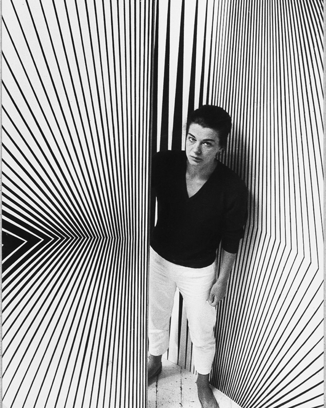
Black and white, line and contrast
The classic black and white Op Art works are often the most dramatic introduction to the movement. Without the distraction of colour, artists could focus on the tension between line, shape, edge, and contrast. Wavy lines placed close together can create a rippling surface. Repeated geometric units can produce a sense of swelling or contraction. Simple square or circular forms can appear to rotate, hover, or break apart.
Black and white also sharpen the figure ground relationship. In many Op Art works, you are never completely sure what is foreground and what is background. The image may flip between readings. That instability is a major part of the effect.
Bridget Riley’s early black and white paintings are a superb example. Her works do not merely imitate movement. They generate a visual event in which the viewer feels movement happening in front of them, even though every mark is fixed and precise.
Colour and chromatic vibration
Although black and white works often define Op Art in the public imagination, colour became one of the movement’s richest areas. Artists discovered that colour relationships could create optical effects as powerful as line and contrast.
Certain colour combinations appear to advance or recede. Others seem to shimmer at their edges. Repeated stripes in carefully calibrated hues can set up rhythms that feel unstable or alive. Colour in Op Art is rarely just decorative. It is structural. It changes how space is experienced.
This is one reason Bridget Riley’s later colour works are so remarkable. They show that Op Art is not only about tricking the eye with hard contrast. It can also create deeply nuanced sensations through the interaction of adjacent colours, where the image seems to vibrate from within rather than shout from the surface.

Bridget Riley and the art of perception
Any introduction to Op Art has to include Bridget Riley. She is one of the movement’s most important figures and, for a British audience in particular, one of its defining artists. Riley’s work became central to Op Art in the 1960s, especially her black and white paintings that explored optical tension through repeated curves, diagonal shifts, and unstable patterns.
What makes Riley so compelling is that her art is never just a puzzle. There is discipline and structure in every composition, but there is also feeling. Her paintings can feel energetic, lyrical, disorienting, or unexpectedly calm. Even at their most precise, they remain deeply responsive to human perception.
Riley later moved beyond monochrome into colour, producing works in stripes, diagonals, and subtle chromatic sequences that feel less like visual tricks and more like perceptual atmospheres. This helped prove that Op Art was not a narrow fad but a rich field of investigation with room for evolution and depth.
Victor Vasarely and the language of geometric illusion
If Riley gave Op Art some of its most refined and dynamic paintings, Victor Vasarely helped define its broader visual language. Often described as a leading figure, and sometimes as a grandfather of the movement, Vasarely developed a world of geometric abstraction in which shapes appear to swell, warp, radiate, or recede.
His work often uses repeated modules arranged with mathematical clarity, yet the results feel surprisingly alive. Spheres appear to emerge from flat grids. Planes seem to bend. Space becomes elastic. Vasarely’s art shows how a strict geometric system can produce sensations of movement and instability.
He was also important because his approach moved easily between fine art, design, and architecture. That cross disciplinary reach helped Op Art spread beyond the gallery into wider visual culture, from posters and prints to public design.

Other important Op Art artists
While Riley and Vasarely are often the best known names, Op Art was not limited to two artists. Richard Anuszkiewicz explored how colour interactions could create intense visual energy. Jesús Rafael Soto worked at the edge of Op and kinetic art, often incorporating movement and suspended elements. Jeffrey Steele contributed important systematic abstractions, especially in a British context. Josef Albers, though not usually defined only as an Op artist, was hugely influential through his investigations into colour interaction and perception.
Seeing these artists together helps broaden the picture. Op Art is not one single look but a family of approaches that share a concern with visual response, structure, and instability.
Op Art and kinetic art
Op Art is often mentioned alongside kinetic art, and the two are closely related, but they are not identical. Kinetic art involves actual movement, whether mechanical, suspended, motorised, or activated by air or viewer interaction. Op Art usually creates the illusion of movement on a static surface.
The connection matters because both movements are interested in activating the viewer and breaking away from the idea of the artwork as a quiet, self contained object. In both cases, perception becomes central. The artwork is not complete without the viewer’s experience of it.
How to recognise Op Art
If you are trying to identify Op Art in a gallery or museum, a few clues can help.
First, look for repetition. Op Art often uses repeated elements such as stripes, circles, grids, waves, or geometric units.
Second, notice whether the image seems unstable. Does it shimmer, pulse, vibrate, bend, bulge, recede, or flash as you look at it?
Third, ask whether the work is representational. Most Op Art avoids depicting recognisable objects or scenes. It focuses on abstract visual structure.
Fourth, pay attention to figure and ground. If you are not sure what is foreground and what is background, you are often in Op Art territory.
Fifth, look at the relationship between control and sensation. The composition is usually extremely precise, but the experience it produces can feel surprisingly volatile.
Why Op Art can feel physical
One of the most interesting things about Op Art is that it can feel physical even when nothing physically happens. Viewers often describe feeling dizzy, energised, unsettled, or pulled off balance. Some works feel almost too intense to look at for long.
This response is part of what gives Op Art its power. It reminds us that vision is embodied. Looking is not just an intellectual act. It involves the nervous system, attention, movement, and bodily orientation in space. Op Art makes that visible by turning a flat picture into something closer to an event.
For beginners, this is useful because it gives you permission to trust your own reaction. If a work seems to flicker or move, that response is not naive. It is exactly where the artwork begins.
How to look at Op Art in person
Op Art really rewards in person viewing. Reproductions can give you the basic pattern, but they often flatten the experience. In a gallery, scale matters. Surface matters. Your movement matters.
Start by looking from a distance. Notice the overall structure before you get close. Then step nearer and see how the pattern changes. Move slightly to one side. Let your eyes shift focus. Notice whether the work feels different in your peripheral vision.
Do not rush. Op Art unfolds over time. What looks simple at first may become much stranger after a minute or two. Some works intensify the longer you look. Others settle into harmony after an initial jolt.
It also helps to notice your own body. Are you leaning in, stepping back, squinting, tilting your head, or adjusting your balance? Those reactions are part of the encounter.
The Responsive Eye and the 1960s moment
The 1965 exhibition The Responsive Eye at the Museum of Modern Art in New York was a major turning point in the public reception of Op Art. It gathered together a wide range of artists concerned with perception and helped establish Op Art as an international phenomenon.
The title itself is revealing. The emphasis was not simply on the object but on the viewer’s eye as active and responsive. That idea captures something essential about Op Art. It is not just a style of pattern making. It is a way of staging perception.
The exhibition also accelerated the movement’s entry into mainstream culture. Suddenly optical patterns appeared not just in galleries but in magazines, clothing, shop windows, and interior design. This visibility helped Op Art become one of the most recognisable looks of the decade.

Op Art in fashion, design, and popular culture
Few modern art movements moved into everyday design as quickly as Op Art. Its high contrast patterns and geometric rhythms translated naturally into textiles, fashion prints, graphic design, posters, record sleeves, and commercial imagery.
That widespread adoption made Op Art familiar even to people who had never visited a museum. Many people recognise the look before they know the name. Black and white zigzags, vibrating stripes, and warped checkerboards have become part of the visual vocabulary of modern life.
This crossover also explains why Op Art can sometimes be underestimated. Because it entered popular culture so thoroughly, it is easy to mistake it for surface style alone. But the best design inspired by Op Art works precisely because the original artworks had such a strong understanding of visual tension, perception, and rhythm.
Common misunderstandings about Op Art
One misunderstanding is that Op Art is just a clever trick. In reality, the strongest examples are carefully structured explorations of visual knowledge, not party pieces.
Another misunderstanding is that Op Art is cold. Its forms may be geometric, but the experience can be surprisingly emotional. Some works feel exhilarating. Others feel unstable or meditative. A painting can be highly systematic and still produce a vivid emotional charge.
A third misunderstanding is that Op Art belongs entirely to the past. Although its peak public visibility came in the 1960s, its ideas remain highly relevant in contemporary art, digital culture, moving image, immersive installations, and design.
Op Art and contemporary visual culture
Op Art still matters because the questions it asks are still our questions. How stable is perception? How do patterns affect attention? How do colour, repetition, and contrast guide the eye? What happens when visual information becomes overwhelming?
These questions feel especially contemporary in a world shaped by screens, interfaces, animation, scrolling, branding, and algorithmically generated images. We now live among visual systems that constantly compete for attention, and Op Art helps us understand how powerful simple visual structures can be.
Contemporary artists continue to draw on Op Art’s lessons, whether directly through optical patterning or more loosely through installations and digital works that make perception unstable. Even when the look changes, the underlying fascination with visual response remains.
Why Op Art still works so well in a gallery
In a contemporary gallery such as Town Quay Studios, Op Art offers something rare. It can be immediately accessible while still rewarding close, sustained looking. A visitor does not need specialist knowledge to feel the effect. At the same time, the work opens onto deeper questions about abstraction, embodiment, structure, and perception.
This makes Op Art an excellent bridge for viewers who think abstract art is too distant or theoretical. It proves that abstraction can be direct, physical, and memorable. It also reminds us that a painting does not need to tell a story or depict a figure to create drama.
For artists, Op Art remains instructive because it shows how much can be done with very limited means. A small visual vocabulary, used with precision, can generate enormous complexity. That lesson continues to matter across painting, print, textiles, digital practice, and installation.
How to talk about Op Art without sounding vague
If you are writing or speaking about Op Art, it helps to move beyond saying that it is trippy or eye catching, even if those reactions are valid.
Try describing exactly what the work does. Does it seem to ripple? Does the space feel like it is expanding? Do the edges flicker? Does the image become unstable when you move? Does colour create push and pull?
Then ask how the artist is achieving that effect. Through repeated lines? Through curves? Through grid distortion? Through colour contrast? Through a tension between flatness and depth?
That simple shift, from vague reaction to precise description, helps unlock why Op Art is so compelling.
A few questions to bring into the gallery
What happens to the image when I step closer?
Does the work feel different in my peripheral vision than in direct focus?
Is the pattern creating movement, depth, vibration, or all three?
How much of the effect comes from black and white contrast, and how much comes from colour?
Does the work feel playful, calm, agitated, elegant, or disorienting?
What is the relationship between strict control and unstable sensation?
These questions help turn a quick glance into a much richer encounter.
Why Op Art still matters
Op Art matters because it reminds us that seeing is active, unstable, and deeply shaped by visual structure. It takes the supposedly simple act of looking and reveals it to be dynamic, interpretive, and bodily.
It also matters because it changed the language of modern art. It helped shift attention from subject matter to perception, from storytelling to sensation, from image as window to image as event. Its influence spread far beyond the gallery, shaping design, fashion, and visual culture in ways that still surround us now.
Most of all, Op Art matters because it remains exciting. It can still surprise viewers, still generate wonder, and still make a static surface feel oddly alive. In a culture saturated with moving images, that is no small achievement.
Op Art is easy to enjoy and hard to exhaust. On first encounter, it offers instant visual impact. Look longer, and it opens into questions about perception, abstraction, order, tension, and the strange collaboration between eye and mind.
That is why Op Art continues to hold its place in art history and contemporary visual culture. It is not just a style of optical illusion. It is a way of making vision visible.
The next time you come across a painting that seems to move even while standing still, do not dismiss the sensation as a trick. Stay with it. Let your eyes adjust. Move around. Notice what changes. In that unstable space between surface and perception, Op Art begins to do what it does best.
Leave a Reply