No products in the cart.
What Is Minimalist Art? Origins, Artists and How It Changed Contemporary Design
Minimalist art at a glance
Minimalist art stripped visual language back to its essentials. Instead of dramatic gesture or personal symbolism, it focused on clarity, geometric forms, and the direct presence of the work in space. The movement took hold in the early 1960s and 1970s, largely in the United States, and it continues to shape how we see contemporary art and design today. Museums frame Minimalism as a shift from expressive painting to works that emphasise order, serial structure, industrial materials, and the viewer’s encounter with the object.
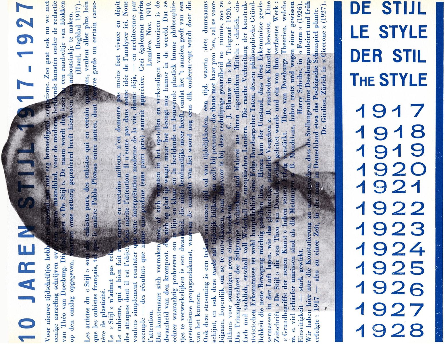
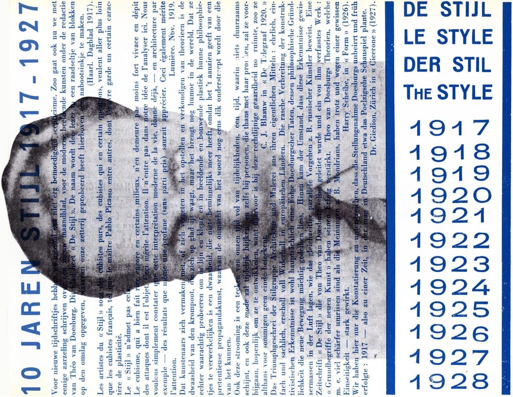
Minimalism grew out of a wider conversation with Abstract Expressionism and geometric abstraction. Artists reacted to the drama of the Abstract Expressionists by choosing restraint, repetition, and clarity. Writers at the time even coined the label ABC Art to describe this new sensibility. These roots matter because they explain why Minimalist works often look simple yet feel rigorous, with ideas drawn from earlier European movements such as De Stijl and from the new climates of New York in the 1960s.
What should readers expect from this guide. First, a clear definition in plain language. Second, a concise history that links the movement to key figures such as Donald Judd, Sol LeWitt, Agnes Martin, Robert Ryman, Barnett Newman, Robert Morris, Ellsworth Kelly, and Ad Reinhardt. Third, a practical look at how Minimalism influenced architecture, interiors, and product design. The aim is to show how a work of art with very little on its surface can still change how we think about space, materials, and the art world today.
What Minimalist art?
Minimalist art is a movement that emerged in the early 1960s. Artists simplified what a work of art looks like and how it is made, using clear geometric forms, repeated units, and industrial materials. Instead of emotion on the surface, the focus is on the object itself, the space around it, and the viewer’s experience in real time. Leading museums describe Minimalism as a turn toward essentials, stripped of narrative or illusion.
Writers at the time used the label ABC Art to capture this clear, pared back approach. The movement developed in dialogue with abstract expressionism and reacted to the intensity of the abstract expressionists. It also drew on earlier ideas from geometric abstraction and De Stijl. These roots explain why Minimalist works often look simple yet feel rigorous, with strong ideas about proportion, order, and perception.
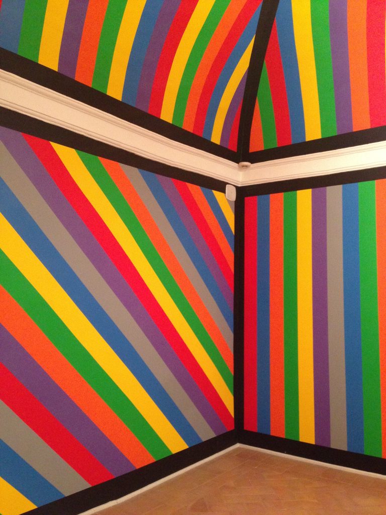
Key characteristics at a glance
- Geometric forms
Squares, rectangles, cubes, and modular shapes appear again and again. These basic forms guide the eye to proportion, rhythm, and the structure of space. - Serial repetition
Many works use series or stacks. Repetition tests how a simple unit changes meaning when placed in sequence. - Industrial or standard materials
Steel, aluminium, Plexiglas, concrete, and plywood are common choices. Fabrication can involve workshops and technicians, which shifts attention from brushwork to construction. - Literal presence in real space
Minimalist art does not aim for illusion. It occupies the room and makes the viewer aware of scale, light, and movement through space. The gallery becomes part of the experience. - Clear roots and reactions
Minimalism grew out of conversations with abstract expressionism and moved toward restraint and clarity. It also relates to earlier geometric abstraction and De Stijl. Think of the 1960s and 1970s as the key decades when these ideas crystallised.
A simple checklist for looking
Use this quick test when you stand in front of a Minimalist work.
• Is the form simple and geometric rather than expressive
• Do you notice modules, stacks, grids, or repeated units
• Are the materials standard or industrial, such as metal, plastic, or plywood
• Does the work feel more like an object in the room than a picture of something
• Do you become aware of your own position and movement as you look
• Can you connect it to the 1960s and 1970s, or to ideas from geometric abstraction and De Stijl
Origins and context
Minimalist art did not appear out of thin air. It grew from a mix of reactions, borrowings, and fresh ambitions that took shape in the late 1950s and gathered pace through the 1960s and 1970s. To understand why the work looks so pared back, it helps to see what it pushed against, and which earlier movements it built upon.
From Abstract Expressionism to reduction
In the decade after the Second World War, Abstract Expressionism dominated studios and galleries. Painters aimed for intensity, spontaneity, and the trace of the hand. By the start of the 1960s, some artists felt that this energy had turned into mannerism. They wanted art that was less about individual emotion and more about clear structure. The result was a move toward restraint and clarity. Instead of vigorous brushwork, Minimalist artists turned to straight lines, repeated units, and measured proportions. The heat of the gesture gave way to the cool presence of the object.
ABC Art and a new vocabulary
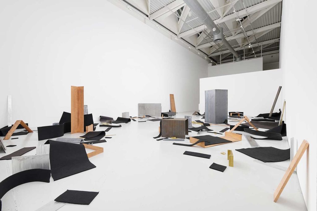
The label ABC Art captured the plain speaking character of early Minimalism. Artists began to set aside illusion in favour of what they called specific objects. A cube was a cube, not a symbol or a picture of something else. Modules could be stacked, placed in rows, or lined along a wall to test how repetition changes meaning. This shift created a new vocabulary for sculpture and painting: serial order, standard materials, clean edges, and an emphasis on the viewer moving through space.
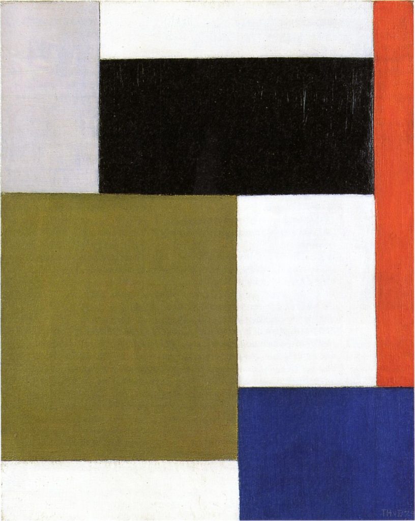
European roots in geometric abstraction and De Stijl
Minimalism was rooted in the earlier experiments of European geometric abstraction. The clarity of form and careful proportion that defined De Stijl proved especially influential. The idea that art could be reduced to essential relationships of line, plane, and colour sat comfortably with the Minimalist desire for order. Although Minimalism emerged mainly in New York, its language reached back to these European precedents, turning them into something more physical and architectural.
The New York crucible
New York in the early 1960s offered the right conditions for this change. Industrial materials were readily available. Fabricators and workshops could realise precise plans in metal, Plexiglas, or plywood. Artists used the city itself as a testing ground, installing stacks, slabs, and grids in galleries that treated space as part of the work. The gallery became not just a container but a partner in the experience, since scale, light, and placement shaped what the viewer felt.
Key figures who shaped the turn
A handful of artists helped define the direction of Minimalism. Donald Judd argued for specific objects and used serial stacks to clarify ideas about order and space. Sol LeWitt turned systems and instructions into wall drawings and modular structures, which made the idea as important as the finished object. Agnes Martin pursued quiet grids with a near meditative focus on rhythm and touch, showing that calm can carry great intensity. Robert Ryman explored the monochrome and the support itself, asking what a painting is when surface, fastening, and edge become the subject. Ad Reinhardt pushed painting towards a limit with near black canvases that reward patient looking. Barnett Newman used the zip to create fields of colour that alter how a viewer senses scale. Ellsworth Kelly refined hard edge colour and shaped canvases with a clarity that sits close to Minimalist aims. Robert Morris explored both strict geometric forms and softer, process based works such as felt pieces, which brought gravity and chance into the conversation.
Materials, methods, and the role of fabrication
Minimalist artists valued clarity of make. Industrial finishes and standard units removed traces of personal touch and shifted attention to proportion, placement, and relation. Fabrication was not a shortcut. It was a method that served the idea. When a series of metal boxes looked identical, the viewer had to focus on spacing, height, light, and the rhythm of repetition. These choices underscored the point that Minimalism is as much about how an object sits in the world as it is about the object itself.
The viewer at the centre
One of the most important changes brought by Minimalism is the role of the viewer. Instead of standing at a distance in front of a picture, you often navigate around a three dimensional work, or you feel your body respond to scale and light inside a gallery. The work of art exists as a set of relations that complete themselves only when someone looks, walks, or waits. This attention to the lived encounter paved the way for later installation and site specific practices.
Why this history still matters
The path from Abstract Expressionism to Minimalism explains why the movement feels both simple and exacting. It is not minimal for the sake of fashion. It is minimal in order to test how little is needed to make a strong experience. The blend of European geometric thinking with the industrial reality of 1960s New York created a language that still shapes contemporary art and design. When a building lobby uses clean planes and precise modules, or a product designer prefers clarity over decoration, you can often trace the lineage back to these decades when artists rethought what an artwork could be.
Key artists and landmark works
Minimalist art took shape through a set of artists who preferred clarity, order, and directness. Their works often use geometric forms, serial arrangements, and standard materials. What follows is a clear guide to the figures most readers will meet first, along with the ideas that make their work matter.
Donald Judd: specific objects and serial stacks
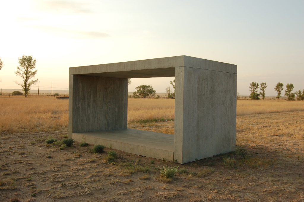
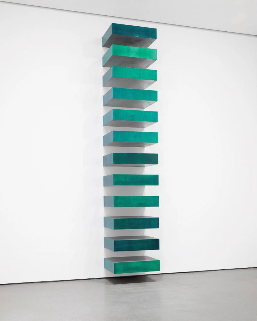
Donald Judd argued that sculpture should be understood as specific objects rather than pictures or symbols. His series of wall mounted boxes titled Untitled, often fabricated in metal and Plexiglas, show how repetition can transform a simple unit into a complete experience. Each box is identical in size, yet spacing, height, and light create subtle changes as you move along the row. Judd’s approach shifted attention from the artist’s hand to proportion, alignment, and the relation between object and room.
Sol LeWitt: systems, instructions, and wall drawings
Sol LeWitt treated the idea as the engine of the artwork. He wrote instructions that others could carry out, whether for wall drawings or modular structures. The result is rigorous yet open, since the concept remains constant while each realisation responds to a specific site. LeWitt shows how Minimalism overlaps with conceptual art, where authorship is shared and the viewer reads both the system and the visual result.
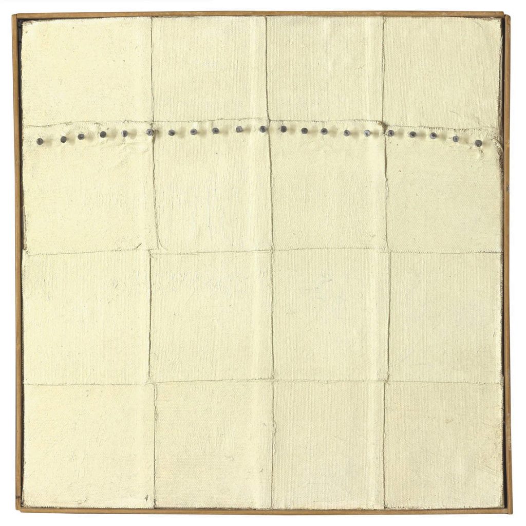
oil, nails, and canvas on canvas mounted on wood
Agnes Martin: quiet grids and measured calm
Agnes Martin’s canvases seem simple at first glance, yet they reward close attention. Hand drawn lines and pale fields create rhythmic grids that hum with calm. Martin’s work proves that Minimalism is not only about industrial finish. Her paintings join restraint with touch, turning subtle changes of line and tone into a profound experience of balance and clarity.
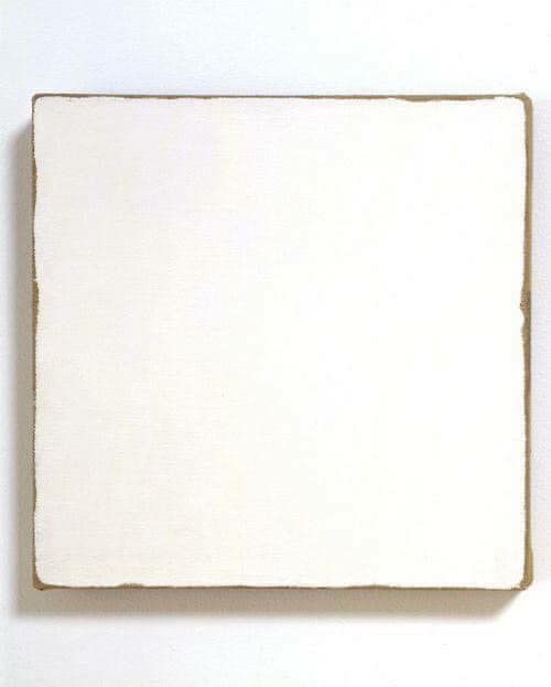
Robert Ryman: the painting as object
Robert Ryman explored what a painting is by focusing on surface, support, fastenings, and edge. Many of his works are near monochrome, yet each makes us look at how paint sits on material, how a panel meets the wall, and how brackets or bolts become part of the composition. Ryman helps viewers see that even a restrained surface can hold many decisions about construction and display.
Ad Reinhardt: the limit of painting
Ad Reinhardt’s late black paintings appear uniform, but after time your eyes begin to register barely visible grids and crosses. These works ask for patient looking. They sit at the edge of visibility and test how little a painting can show while still being a work of art. Reinhardt forms a bridge from Abstract Expressionism to Minimalist restraint, turning intensity inward rather than outwards.
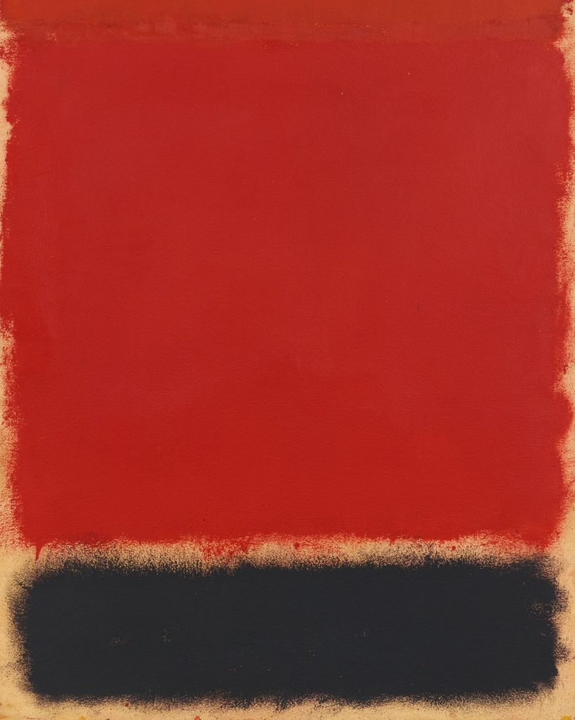
Barnett Newman: scale, colour, and the zip
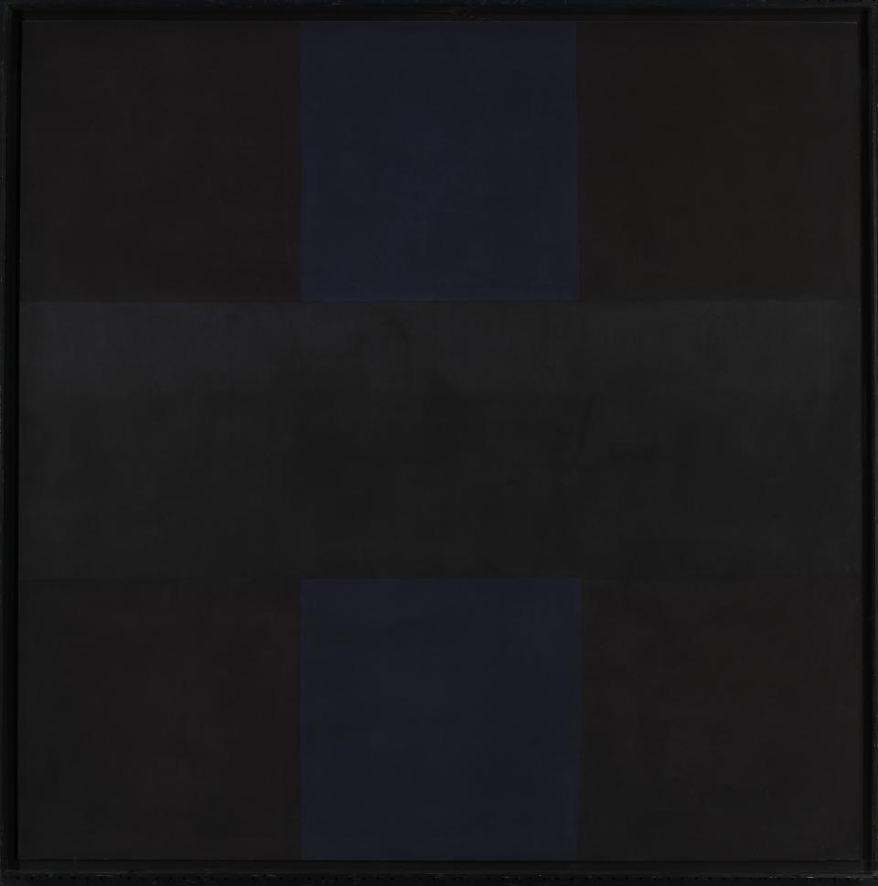
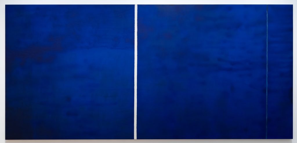
Barnett Newman’s large fields of colour interrupted by narrow vertical bands, which he called zips, create a powerful sense of scale. The paintings feel at once simple and vast. The zip acts as a measure that reorganises the plane, altering how the viewer senses the edge, the centre, and their own position before the work. Newman’s clarity of structure aligns closely with the Minimalist preference for essential form.
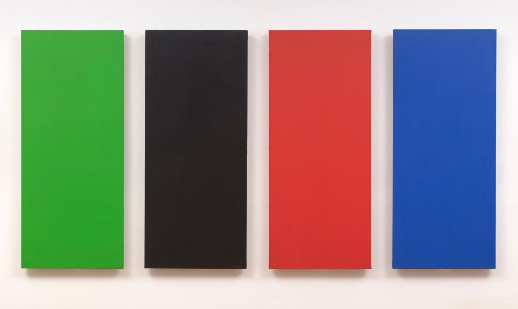
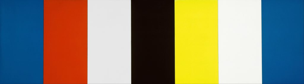
Ellsworth Kelly: hard edge colour and shaped canvases
Ellsworth Kelly refined colour and contour into crisp, clean statements. He used shaped canvases and precise blocks of colour to remove illusion and focus attention on form. Kelly’s paintings and reliefs show how geometric abstraction flows into Minimalism, where clarity and economy guide both shape and hue.
Robert Morris: form, process, and perception
Robert Morris helped define Minimalist sculpture with simple polyhedral forms placed directly in the gallery. He later introduced soft materials such as felt, which he cut and allowed to drape under its own weight. This brought gravity, chance, and time into the work. Morris also wrote important texts that framed Minimalism as a study of perception and bodily awareness, placing the viewer at the centre of the encounter.
Why these artists still matter
Taken together, these figures set the terms for Minimalist art. Donald Judd’s specific objects, Sol LeWitt’s systems, Agnes Martin’s grids, Robert Ryman’s surfaces, Ad Reinhardt’s limits, Barnett Newman’s zips, Ellsworth Kelly’s hard edge colour, and Robert Morris’s forms and felt all demonstrate how simple means can yield rich results. Their work continues to shape contemporary art and design, from the way museums display space to the way architects and product designers use proportion, rhythm, and reduction.
How Minimalism changed contemporary design
Minimalism did more than reshape painting and sculpture. Its principles filtered into architecture, interiors, furniture, product design, and even digital interfaces. Designers took the core ideas of clarity, proportion, and reduction, and applied them to the objects and spaces people use every day.
From gallery floor to everyday life
Early Minimalist works showed how a simple unit, repeated with care, could change the feel of a room. Designers adopted that lesson. Repetition of modules appears in shelving systems, façade grids, and seating plans. The point is not decoration. The point is rhythm, order, and calm. A design stands out by how well parts relate to each other, not by how much surface detail they carry.
Architecture and the language of clean planes
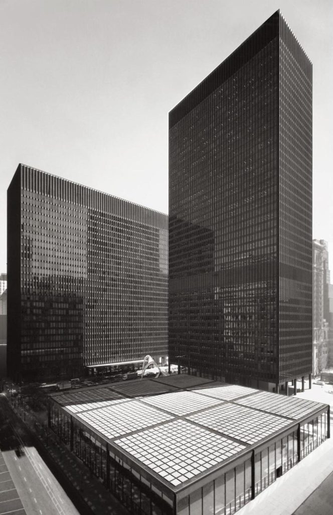
Architects drew on the movement’s preference for clear geometry and honest materials. Flat planes, right angles, and continuous surfaces replaced fussier outlines. Concrete, glass, steel, and pale timber became the palette for calm, light filled spaces. The result is not coldness, but focus. When structure is legible, people read a space quickly and use it with confidence. Scale, proportion, and light do the expressive work.
Interiors that prioritise use
Minimalist thinking helped shift interiors toward function with character. Storage is integrated rather than added on. Lines stay clear so rooms feel open and easy to navigate. Surfaces work hard. A single material can run from floor to wall to built in furniture, which reduces visual noise and lets people and objects breathe. The best minimalist interiors do not feel empty. They feel considered.
Furniture that respects proportion
In furniture, Minimalism encouraged designers to trust simple geometry. A good table relies on thickness, joint detail, and the spacing of legs. A chair earns its presence through line and comfort rather than extra ornament. The craft is in proportion and joinery. Materials are chosen for performance and feel, whether metal, wood, or engineered composites. Calm comes from doing only what is needed, and doing it well.
Products shaped by clarity
Product design absorbed Minimalism through restraint and usability. Clear interfaces, limited colour, and well judged spacing help people understand a device at a glance. Buttons, bezels, and seams are reduced to what is necessary. When form follows use in this way, the product looks inevitable. It does not shout. It communicates. Minimalist discipline supports longevity too, since a clear object can survive trends.
Graphic design and the grid
Graphic designers borrowed the grid, the module, and the idea of visual hierarchy. Type is spaced with care, colour is used sparingly, and layouts rely on alignment rather than effects. The reader benefits. Information becomes easier to scan, while the identity of a brand still feels strong. In this context, Minimalism is not style for its own sake. It is a working method that guides every decision on the page.
Digital interfaces and user experience
Digital design took Minimalism’s lessons into screens. Interfaces favour uncluttered layouts, consistent spacing, and a small set of components used well. Icons are simple, animations are purposeful, and typography carries much of the tone. This improves speed and accessibility, since users can find what they need without distraction. The influence is clear whenever a dashboard or app feels intuitive on first use.
The ethics of less
There is also an ethical strand. Minimalism asks whether each element earns its keep. That question links to sustainability. Designers who specify fewer parts, longer lasting materials, and modular repair can reduce waste. A product that is easy to understand is often easier to fix. A building that uses passive light and simple forms can cut energy costs. The same clarity that improves aesthetics can also improve impact on the world around us.
Why the connection to art still matters
Keeping sight of the art roots helps designers avoid cliché. Minimalism in the gallery was never about emptiness. It was about precise relations between parts, about how a viewer moves, and about how materials sit honestly in space. When designers apply the same care to alignment, spacing, and proportion, the result feels calm and confident. That is why the movement continues to shape contemporary design, from the scale of a public atrium to the feel of a handset in the palm of a hand.

Materials and methods
Minimalist artists paid close attention to how things are made. Materials are chosen for what they do, not for decoration. Methods are clear and repeatable. The result is art that teaches the eye to notice proportion, alignment, light, and the way objects sit in space.
Industrial fabrication and clean build
Many works are produced with the help of fabricators. This does not remove the artist’s role. It clarifies it. The artist designs the form and sets the rules. Skilled makers then cut, weld, polish, or cast to exact specifications. A clean finish is not a style trick. It is a tool that prevents texture from distracting the viewer, so attention stays on structure and relation.
Modules and the power of the series
Minimalist art often uses modules. A single unit is defined, then repeated. Boxes line a wall. Panels march across a room. Grids cover a surface. Repetition makes small differences easier to see. It also builds rhythm, which the viewer reads as they move. The same unit, placed at a higher or lower height, can feel completely different.
Repetition, time, and the viewer’s route
A series changes as you walk. Distance alters the gap between units. Light shifts across edges. Your steps set a pace. Minimalist artists understood this and composed for time as well as for space. The work is not a single snapshot. It unfolds through looking.
Scale and proportion
Scale is not only about size. It is about relation. A cube that sits just above eye level feels different from one placed at the floor. Proportion controls this effect. Ratios between height, width, depth, and spacing create a sense of balance or tension. Good Minimalist works feel inevitable because these ratios are tuned with care.
Colour and surface
Colour tends to be restrained. Metal may be left as it is. Paint is applied evenly. Plastics are chosen for specific qualities such as translucency or reflection. Some artists prefer a matte surface that absorbs light. Others use gloss to mirror the room. In both cases the aim is to control how light behaves, not to show the trace of the hand.
Materials in common use
Metals
Steel and aluminium provide strength and precision. They take welds cleanly and accept consistent finishes. Edges stay crisp.
Plastics and acrylics
Plexiglas and similar plastics offer clarity and colour control. They can be cut and joined to exact sizes. They change with light in ways that support the work.
Wood and plywood
When used, timber is often selected for a uniform grain, or hidden beneath paint. Plywood gives flatness and stability for panels and boxes.
Concrete and stone
These materials bring weight and mass. Surfaces may be cast smooth so the form remains the focus.
Glass
Used for clarity and reflection. It can make structure visible and space legible.
Joinery, fixings, and the wall
Minimalist work treats fixings as part of the design. Brackets, bolts, and seams are aligned with care. Sometimes they are made visible to explain how the piece is built. At other times they are concealed so that the object reads as a continuous volume. Mounting on the wall follows similar logic. Height and spacing are chosen to guide the body through the room.
Collaboration and documentation
Because fabrication can involve workshops, the plan matters as much as the final object. Drawings, material lists, and detailed instructions form part of the record. This makes works repeatable, and it allows them to be installed in different sites while staying true to the original intent.
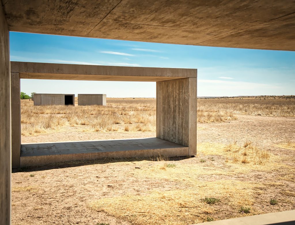
Installation and the role of the room
A Minimalist object never sits in a vacuum. Floors, ceilings, windows, and sightlines shape the experience. Artists often test different placements before settling on one. A piece may need natural side light, or a clear wall with no interruptions, or a precise distance from a corner. The room acts like a frame that finishes the composition.
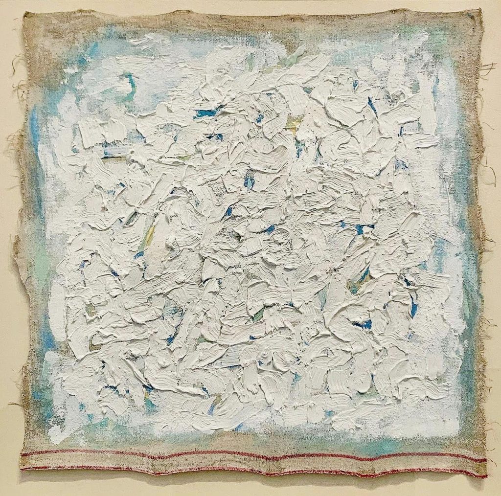
Hand work in a minimal key
Not all Minimalist surfaces are machine smooth. Some painters draw pencil lines by hand or allow slight variation in tone. These choices are quiet, not expressive in the old sense, but they keep the work human. The key is restraint. Every mark must earn its place.
Ageing, care, and repair
Industrial finishes can mark or fade. Plastics can yellow if exposed to harsh light. Metals can scratch. Museums and collectors manage these risks through careful handling and controlled environments. When restoration is needed, the goal is to return the work to its intended state without adding new visual noise.
Why methods matter
Methods are not backstage details. They are the meaning. A work built from standard units tells a story about order and repetition. A perfectly even surface focuses the eye on proportion. A measured install height sets the tempo for the body. In Minimalism, how something is made is inseparable from what it says.
Conversations and critiques
Minimalism arrived with clarity and order, yet it quickly attracted debate. Those discussions help readers understand what the movement wanted to achieve, and where its limits appeared.
The ABC Art label and first responses
The early nickname ABC Art captured the plain speaking look of Minimalist work. Supporters valued its honesty and focus. Detractors felt it risked coolness or detachment. The best way to read those responses is to compare a gestural painting from the 1950s with a serial stack from the 1960s. One asks you to feel the force of a mark. The other asks you to notice proportion, spacing, and how your body moves in relation to the object.
Authorship, craft, and the role of fabrication
Minimalist artists often worked with fabricators. This sparked questions. If a technician polishes the metal, what is the artist’s contribution. The answer sits in the plan. Artists defined the form, the dimensions, the finish, and the install. Fabrication was a disciplined method, not a shortcut. It served the idea that the work of art should present itself plainly, with as few distractions as possible.
The viewer as an active participant
Another debate centred on the viewer. Minimalism placed the viewer at the centre of the experience. You complete the work by walking around it, by sensing scale, and by feeling how light shifts on a surface. Some critics argued this was too clinical. Others saw it as a strength, since it made perception itself the subject.
Gender, omission, and the record
Early writing on Minimalism favoured a small set of male artists. Later scholarship highlighted the importance of Agnes Martin and other figures who were not always given equal space in the first accounts. That correction matters. It shows that Minimalism was a broad field that included different approaches to material, touch, and tone, not a single narrow style.
Post Minimal and process based responses
By the late 1960s, artists began to probe Minimalism’s edges. Some introduced softer or more unstable materials, such as felt, rubber, or rope. Others allowed gravity, chance, and time to shape the result. This is often called Post Minimalism or Process Art. It kept the interest in clarity and materials, while allowing disorder and change to enter the work.
Market minimalism and surface style
As Minimalism influenced design and fashion, a surface style sometimes replaced the original depth. Clean rooms and white boxes can look minimal without carrying the discipline behind the work. The answer is to return to first principles. Minimalism is not emptiness for its own sake. It is careful proportion, clear method, and an honest relation between object, space, and viewer.
Minimalism and contemporary artists today
Minimalism continues to shape contemporary art. Many artists use geometric forms, serial structures, and controlled surfaces, while bending those tools to new subjects.
Light, space, and perception
Artists who work with light build environments that echo Minimalist concerns. The room itself becomes material. Viewers sense shifts in brightness, colour, and shadow as they move. The lesson from Minimalism remains clear. Control the elements, then let the experience unfold in real time.
Material clarity with new technologies
Digital fabrication allows precise cutting and joining in metal, plastic, and wood. Artists use these tools to build complex yet readable forms. The goal is not a tech display. It is the same clarity of proportion and finish that defined earlier Minimalist work, now updated with contemporary methods.
Hand, line, and the quiet grid
Painters and draughtspeople continue to explore grids, stripes, and repeated units. Some keep a visible hand in the line, which softens the result without losing order. Others remove touch almost entirely. Both approaches show how Minimalist values can support very different atmospheres, from meditative calm to crisp optical play.
Public space and the measured landmark
Minimalist principles suit public commissions. A clear form reads well at distance. A measured rhythm holds a plaza without shouting. Artists who work in civic settings often adopt modular units, simple volumes, and robust surfaces that weather over time. This updates the Minimalist interest in the relation between object and site, now addressed at urban scale.
Crossovers with design and architecture
Contemporary practices often sit between art and design. Installations that use modular shelving, standard panels, or lighting systems operate like living diagrams of Minimalist thought. The boundaries are porous. What matters is how carefully each element is specified and how precisely the whole sits in its environment.
Why the legacy endures
Minimalism gave artists a toolkit that still works. Use simple forms. Choose materials for what they do. Install with care. Invite the viewer to complete the work through looking and movement. These principles continue to generate fresh results because they are rooted in perception, not in fashion.
Timeline at a glance
Minimalism took shape over several decades. This quick guide maps the key moments so readers can place artists and ideas in time.
Late 1950s
Painters and sculptors begin to react against the intensity of Abstract Expressionism. Conversations shift toward order, clarity, and the object in real space. Early experiments with geometric forms and serial structure appear in studios and small exhibitions.
Early 1960s
The vocabulary of Minimalism crystallises in New York. Artists adopt modules, grids, and industrial materials. The idea of the specific object gains ground. Writers start to use the label ABC Art to describe the new look and attitude.
Mid to late 1960s
Landmark works by Donald Judd, Sol LeWitt, Robert Morris, Agnes Martin, Robert Ryman, Barnett Newman, Ellsworth Kelly, and Ad Reinhardt shape public understanding. Exhibitions group these practices together and present Minimalism as a coherent movement. Fabrication methods mature, which allows precise finishes and repeatable series.
Early 1970s
Debate intensifies. Some artists push beyond stable forms into softer or more changeable materials. This leads to Post Minimal and process based work. At the same time, Minimalism influences design culture, architecture, and product thinking.
Late 1970s and after
Museums consolidate the history through collection and scholarship. Designers adopt the lessons of proportion, repetition, and clarity. The legacy continues as contemporary artists use minimal means to shape large installations, public commissions, and digital environments.
Frequently asked questions
What is Minimalist art in one sentence
A movement that emerged in the 1960s which stripped art down to essential forms, often using geometric shapes, serial structures, and industrial materials to focus attention on space, proportion, and the viewer’s experience.
How did Minimalism respond to Abstract Expressionism
It replaced gestural drama with measured clarity. Instead of the visible trace of emotion, Minimalist artists presented objects that emphasised order, repetition, and direct presence in the room.
What makes a Minimalist work different from geometric abstraction
Geometric abstraction explores non figurative composition within the picture plane. Minimalism often pushes those ideas into three dimensional space and treats the artwork as a literal object that shares the viewer’s environment.
Why is Donald Judd’s Untitled often cited
Because it demonstrates the power of a simple unit repeated with care. The identical modules, precise spacing, and industrial finish redirect attention from craft flourishes to proportion, light, and the relation between object, wall, and floor.
Where do Sol LeWitt and Agnes Martin fit
Sol LeWitt shows how an idea can drive a work through systems and instructions. Agnes Martin proves that restraint can include a quiet human touch through hand drawn grids and subtle tonal shifts.
What did Robert Morris contribute
He helped define Minimalist sculpture with simple volumes, then tested its limits with felt and other pliable materials. His writing framed Minimalism as a study of perception and bodily awareness.
Are Barnett Newman, Ellsworth Kelly, and Ad Reinhardt part of Minimalism
They sit close to its aims. Newman’s zips, Kelly’s shaped colour fields, and Reinhardt’s near black paintings shaped the climate that allowed Minimalism to emerge, even as each artist followed a distinct path.
How did Minimalism change contemporary design
It promoted clarity, proportion, and reduction. The lessons appear in architecture, interiors, furniture, product design, and digital interfaces. Clean planes, modular systems, and honest materials help people read spaces and objects quickly and use them with confidence.
Is Minimalism only about white rooms and empty surfaces
No. It is about precise relations between parts. The best Minimalist work feels considered and balanced. It can use colour, texture, and weight, as long as every element serves the structure and the experience.
What should I look for when I see Minimalist art in person
Notice height, spacing, and your own route through the room. Watch how light moves across surfaces. Ask how the work uses proportion to set a rhythm. Give it time. Many Minimalist pieces unfold through patient looking.
Minimalism emerged from a clear need to rethink what a work of art could be. Artists moved from expressive marks to precise objects, from private gesture to shared space, and from decoration to measured proportion. In doing so they created a language that still shapes contemporary art and design.
The core ideas are simple to name and rich to explore. Geometric forms. Serial order. Industrial materials. Careful installation. A viewer who completes the work by moving, looking, and noticing. Donald Judd’s specific objects, Sol LeWitt’s systems, Agnes Martin’s grids, Robert Ryman’s surfaces, Robert Morris’s volumes and felt, Barnett Newman’s zips, Ellsworth Kelly’s colour and contour, and Ad Reinhardt’s near black fields all show different paths to the same clarity.
The influence reaches well beyond the gallery. Buildings, interiors, products, and digital interfaces often succeed when they adopt the same discipline. Choose materials for what they do. Let structure speak. Remove what is not needed. Make every relation count. Minimalism keeps returning because it helps viewers and users see space, form, and purpose with fresh eyes.
Leave a Reply