No products in the cart.

The Importance of Tone in Art Techniques Every Artist Should Know
Why Tone Matters in Art
Tone is one of the most fundamental elements in visual art, yet it’s often overlooked by those just beginning their artistic journey. In its simplest form, tone refers to the lightness or darkness of a colour, entirely separate from its actual hue. Whether you’re working in pencil, paint, charcoal, or digital media, tone plays a vital role in shaping how a viewer experiences your work.
When used effectively, tone allows an artist to create the illusion of depth and form on a flat surface. It gives a sense of volume to objects, defines light sources, and can evoke atmosphere whether it’s the moody stillness of a foggy landscape or the crisp clarity of a sunlit figure. Tone is also crucial for guiding the viewer’s eye across the composition. Strong contrasts between light and dark can establish focal points, leading attention to key areas of the artwork.
Beyond technical application, tone has emotional weight. A composition dominated by darker tones can feel brooding or introspective, while one filled with lighter tones might feel open, airy, or even joyful. In this way, tone helps set the mood and meaning of a piece, regardless of the subject matter.
The Tate Gallery defines tone as “the relative lightness or darkness of a colour” and notes that it’s key to the success of many works, particularly those in drawing or black-and-white media where colour is absent but visual depth must still be conveyed.
Whether you’re sketching a still life, painting a landscape, or creating a digital portrait, mastering tone will transform your ability to communicate visually. It’s the silent backbone of composition working behind the scenes to bring dimension, clarity, and emotion to your art.
Understanding Tonal Values
Tonal value is one of the most essential principles in art yet it’s often misunderstood or underestimated. At its core, tonal value refers to the relative lightness or darkness of a colour. It is what allows artists to depict light, shadow, and the illusion of form within a two-dimensional space. Understanding tonal values is the key to creating convincing compositions that resonate visually and emotionally.
The Tonal Scale: From Dark to Light
Tonal values exist on a continuous scale, ranging from the darkest blacks to the brightest whites, with an entire spectrum of greys in between. This scale can be broken down into broad categories:
- Dark tones: Near-black or deep shades that create contrast and grounding elements within a composition.
- Mid-tones: The middle range of values that often form the majority of a painting or drawing. They act as transitions between the darks and lights.
- Light tones: The brightest areas, used to highlight form and reflect light.
Together, these tonal variations provide the foundation for building depth, contrast, and atmosphere.
Tonal Values in Monochrome: Seeing Without Colour
Tonal value becomes especially important in black-and-white or monochromatic artworks, where hue (colour) is not available to describe the scene. Here, it’s purely tone that shapes everything from defining contours and building forms, to establishing space and light direction. Without strong tonal contrast, an image can appear flat or unreadable to the viewer.
This is why many artists practise in charcoal, pencil, or ink these mediums force the eye to see tonal differences clearly. It sharpens the artist’s ability to “read” a subject based on value, not colour, and strengthens their overall compositional skills.
Why Tonal Values Matter
The human eye is naturally drawn to areas of high contrast. This means tonal values play a crucial role in directing attention. A subject rendered with subtle mid-tones might feel serene or subdued, while sharp tonal contrasts between light and dark can evoke drama, energy, or tension.
Mastering tonal values allows artists to:
- Create the illusion of three-dimensional form
- Define a clear light source
- Shape focal points
- Build atmosphere and narrative
Whether you’re working in graphite, oil paint, or digital illustration, understanding tone is fundamental to visual storytelling.
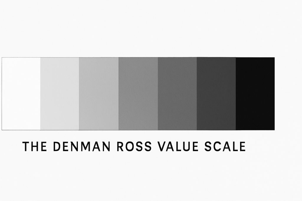
The Value Scale: A Tool for Artists
One of the most practical tools in an artist’s toolkit is the value scale a visual guide that helps map out the range of tonal values from the darkest blacks to the lightest whites. Whether you’re working in pencil, charcoal, watercolour, or oils, the value scale is an essential reference point for understanding contrast, achieving realism, and bringing depth to your work.
What Is a Value Scale?
A value scale is typically represented as a series of rectangles or steps that transition gradually from pure black to pure white, with a range of mid-tones in between. Artists often create their own scales, especially when exploring a new medium, to better understand how to control tone with specific materials.
The scale can vary in complexity from a simple 5-step guide to a more nuanced 9-step or even 10-step version but the purpose remains the same: to provide a reference for comparing tonal relationships in your work.
Using the Value Scale in Composition
The value scale is more than a study tool; it’s a guide for decision-making. Artists use it to:
- Check value accuracy: Ensuring that the lightest and darkest areas are clearly defined.
- Create balanced compositions: Distributing values across the artwork to avoid areas that feel visually flat or overly chaotic.
- Guide focal points: Strong contrasts in value naturally draw the eye artists often place their highest contrasts near the centre of interest to create focus.
For example, placing a bright highlight against a dark background can instantly make a subject pop. Conversely, subtle transitions within the mid-tones can create softness and atmosphere, especially in portraits or landscapes.
The Underrated Role of Mid-Tones
While extremes of light and dark tend to grab attention, mid-tones are the unsung heroes of tonal work. They form the connective tissue that blends highlights and shadows into smooth, realistic transitions. In fact, the majority of visual information in any natural scene falls within the mid-tone range.
Developing an eye for mid-tones and learning how to shift them gradually is crucial for capturing volume, contour, and texture. It’s where much of the subtlety in art lives.
Techniques for Applying Tone
Tone can be applied in a variety of ways, each with its own expressive qualities. From traditional drawing methods to more painterly approaches, mastering tonal application gives artists the tools to bring form, mood and atmosphere to their work. Below are some of the most widely used techniques.
Hatching and Cross-Hatching
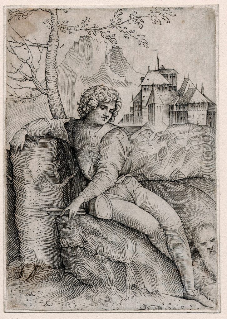
Hatching involves drawing parallel lines close together to create areas of shadow. The closer the lines, the darker the tone. Cross-hatching adds a second layer of lines that intersect the first, allowing for more depth and intensity. This technique is particularly popular in pen and ink work and can be seen in classic etchings and sketches.
Stippling
Stippling builds tone using dots rather than lines. The density and placement of dots determine the darkness of an area more dots create deeper tones, while fewer result in lighter ones. It’s a time-consuming method, but it offers exceptional control and a unique texture that can’t be replicated through other techniques.
Blending
Blending is often used in graphite, charcoal or pastel drawings to create smooth transitions between tones. Artists can use tools like blending stumps, fingers, or soft cloths to soften edges and unify tonal areas. This technique is especially useful for creating realistic textures like skin or soft fabric.
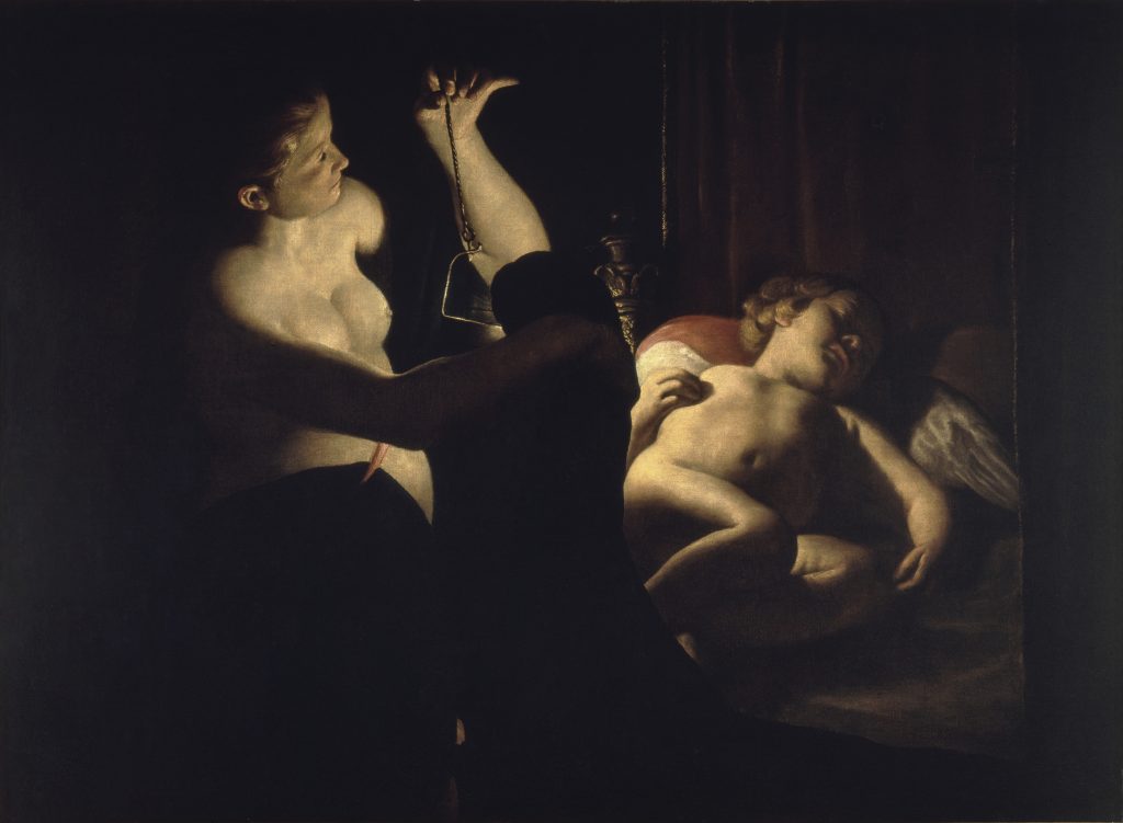
Chiaroscuro
Originating in the Renaissance, chiaroscuro is the use of strong contrasts between light and dark to model three-dimensional forms. It was a favourite technique of artists like Caravaggio and Rembrandt, and it remains a powerful tool for dramatic visual storytelling. By placing a figure in a pool of light against a dark background, artists can achieve striking and emotionally resonant compositions.
High Key and Low Key
These terms describe overall tonal ranges within an artwork. A high key image is made up mostly of light tones, often giving a sense of airiness, delicacy or optimism. In contrast, a low key artwork consists mainly of darker tones, creating a mood that feels more intense, mysterious or sombre. Both approaches can strongly influence the emotional impact of a piece.
Creating the Illusion of Depth and Form
Tone plays a vital role in transforming a flat image into one that appears three-dimensional. By carefully varying tonal values, artists can replicate how light interacts with objects, helping the viewer’s eye read form, depth, and space on a two-dimensional surface.
Tonal Variation and Three-Dimensionality
In the real world, light falls on objects from a specific direction, casting shadows and highlighting raised areas. Artists mimic this effect through tonal variation. By using darker tones in shadowed areas and lighter tones where the light hits directly, they create the illusion of volume and depth.
For instance, when drawing a sphere, applying a gradual transition from light to dark gives the impression that it is round and solid. Without this tonal shift, the shape remains flat and lacks dimension.
How the Eye Sees Light and Shadow
The human eye is naturally drawn to contrast and focal points. We interpret shapes and forms by observing how light interacts with surfaces. Shadows, highlights, and mid-tones give us visual clues that help define an object’s shape and position in space.
Artists use this understanding to guide the viewer’s gaze within a composition. By exaggerating contrasts or softening edges, they can lead the eye through the artwork and draw attention to specific elements.
Using Tone to Create Space
Beyond individual objects, tone is essential for creating a sense of spatial depth in a scene. Lighter tones can be used to suggest background elements that are further away, while darker tones bring foreground elements forward. This technique, known as atmospheric or aerial perspective, has been used for centuries to depict landscapes, interiors, and complex scenes convincingly.
Through tone, an artist can build a layered visual experience that feels immersive and believable.
Tone in Different Art Mediums
The concept of tone is universal across all visual art forms, but the way it is applied can vary greatly depending on the medium. Each discipline has unique tools and methods for establishing tonal contrast and creating visual depth.
Drawing: Tonal Control with Pencil and Charcoal
In drawing, artists rely heavily on tonal values to define form and texture. Pencils, ranging from hard (H) to soft (B), provide varying levels of lightness and darkness. Softer pencils like 6B or 8B produce rich, dark tones ideal for shadowing, while harder pencils allow for lighter, more delicate lines.
Charcoal is another popular drawing medium known for its deep blacks and smooth blendability. Artists use techniques such as layering, smudging, and erasing to develop a full tonal range, from intense shadows to subtle highlights.
Painting: Mixing Tones with Colour
In painting, tone is achieved through colour mixing and application. While colour refers to hue, tone speaks to the lightness or darkness of that hue. Artists create tonal variation by adjusting the ratio of white (tinting) or black (shading) added to a colour.
Painters must constantly evaluate their tones to maintain visual balance and ensure that their compositions are legible. Whether working in oil, acrylic, or watercolour, understanding how to modulate tone is essential for realistic lighting and atmosphere.
Printmaking: Tonal Techniques in Ink
Printmakers use specialised methods to render tonal effects. In aquatint, for example, resin is applied to a metal plate to create areas that hold ink in varying densities. This process allows for smooth transitions between light and dark, unlike traditional line-based etching.
Mezzotint is another technique focused entirely on tone. Artists roughen the surface of a plate uniformly, then smooth out lighter areas to produce highlights, resulting in a rich, velvety range of tones.
Each of these processes relies on a deep understanding of how tonal contrast affects the final image.
Common Mistakes and How to Avoid Them
Even experienced artists can struggle with tone if they overlook its foundational role in shaping depth, light, and structure. Here are a few common pitfalls to watch out for and how to avoid them.
1. Overlooking Mid-Tones
One of the most frequent mistakes is neglecting mid-tones in favour of just light and dark extremes. While highlights and shadows are important, mid-tones create the subtle transitions that make an image feel realistic and fully formed. Without them, artwork can appear stark or overly simplified.
Tip: When sketching or painting, block in a mid-tone first to establish a base. Then build highlights and shadows around it. This will give your composition a more natural sense of depth.
2. Using Tones That Are Too Similar
Another error is using tonal values that are too close together. If everything in a composition shares the same level of lightness or darkness, the result is often flat and lifeless, lacking contrast or visual hierarchy.
Tip: Squint at your work this simplifies tonal values and helps reveal whether your contrast is strong enough. If areas blend together, it’s a sign that tones need to be adjusted.
3. Ignoring Light Sources
Tone is closely tied to lighting. Failing to account for a clear, consistent light source can confuse the viewer and make forms look unconvincing. Shadows may fall in different directions, or objects might lack believable highlights.
Tip: Choose a dominant light source and map out where it hits your subject. Use reference photos or simple lighting setups when working from life to better understand how light interacts with form.
Bonus Tip: Work in Monochrome
If you’re unsure whether your tonal structure is strong, try working in black and white. Stripping away colour helps you focus purely on light and dark relationships, a valuable exercise for developing tonal awareness across any medium.
Exercises to Improve Tonal Skills
Like any element of art, tone improves with practice. Developing tonal awareness can dramatically elevate the quality and realism of your work. Here are a few simple but effective exercises to help sharpen your skills.
Create a Value Scale
Start with a strip divided into 9 or 10 equal sections. Fill in the far left with your darkest tone and the far right with your lightest (often white). Gradually fill in the spaces between with increasingly lighter or darker shades. This helps train your eye to recognise subtle changes in tone and is useful as a reference when working on a piece.
Draw Using Only Tonal Values
Choose a basic object a mug, an apple, or a folded cloth and draw it using only tonal shading, avoiding outlines. Focus on capturing light and shadow rather than the object’s contour. This encourages you to “see” tone first and shape second, which leads to more realistic results.
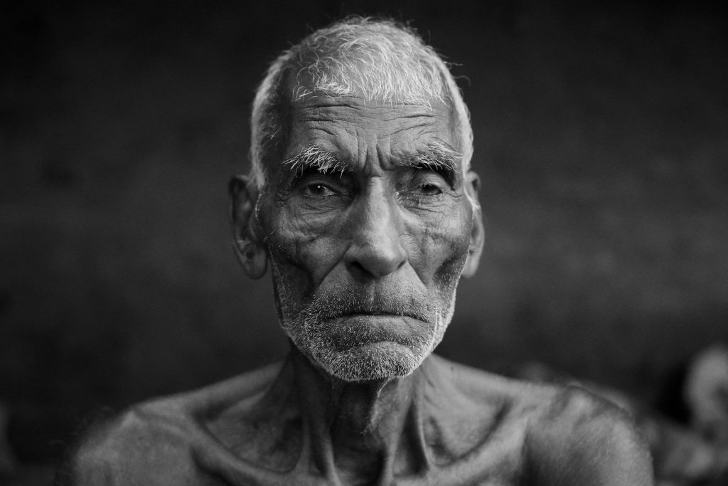
Study Black and White Photographs
Looking at monochrome images strips away colour distractions and forces you to focus solely on tone. Try recreating a black and white photo in pencil or charcoal, paying close attention to how light wraps around forms and where the darkest and lightest areas fall.
These exercises are not only beneficial for beginners but are also used by professionals as warm-ups or to refine technique.
Mastering Tone for Artistic Success
Tone is one of the most powerful yet underrated tools in an artist’s kit. It goes beyond simply adding shading tone defines structure, creates depth, guides the viewer’s eye, and brings mood and realism to your work.
Whether you’re working in pencil, paint, or print, understanding and applying tonal values effectively can be the difference between a flat image and a dynamic, lifelike composition. It’s a skill that takes time and intention to develop, but the rewards are lasting.
By regularly practising tonal exercises, studying light and shadow, and being mindful of tonal contrasts in your work, you’ll not only improve your technical ability but also your artistic confidence.
Mastering tone isn’t just about technique it’s about learning to see the world through a more nuanced lens.
Leave a Reply