
No products in the cart.
Linocut Art Explained: Why This Bold Printmaking Style Still Feels Fresh
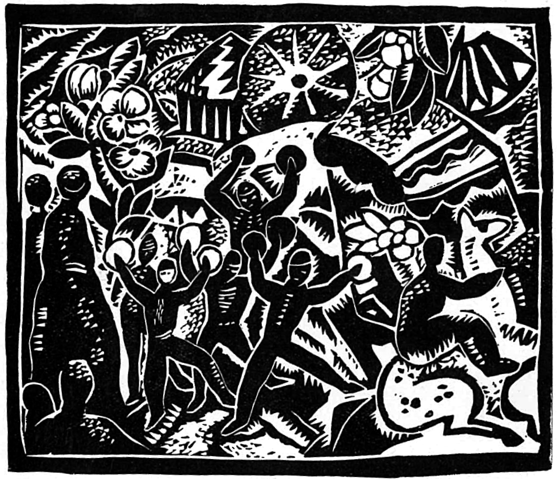
Linocut art has a way of looking both historic and current at the same time. A good lino print can feel rooted in early twentieth century modernism, poster design, craft tradition and hand made process, yet it can also look completely at home in a contemporary interior, an artist led print fair or a gallery wall. That double quality is part of its appeal. Linocut is one of the clearest, most direct forms of printmaking, but it is also one of the most adaptable. It can be graphic and loud, quiet and lyrical, rough edged and immediate, or surprisingly refined.
That is why linocut art still feels fresh. The medium has strong visual character, but it does not trap artists in one style. A lino print can be black and white and highly dramatic. It can be built from flat, confident areas of colour. It can describe architecture, landscape, still life, animals, figures or abstract rhythm. It can carry the marks of the cut very openly, or it can feel carefully controlled and layered. What unites these different approaches is the way linocut simplifies, sharpens and clarifies. It tends to strip an image back to structure. It makes artists commit to shape, contrast, rhythm and decision.
For readers searching for linocut art, what is a linocut, linocut printmaking, lino print explained, relief printmaking, reduction linocut, famous linocut artists, colour linocuts or how linocut differs from woodcut, the deeper question is often broader than simple definition. Why does this medium keep attracting artists? Why does a technique associated with tools, ink and carved linoleum still feel visually alive in a digital image culture? And what makes a strong lino print so recognisable even from across a room?
This guide answers those questions clearly and in depth. It explains what linocut art is, where it came from, how the process works, why artists continue to use it, and what gives lino prints their bold visual force. It also looks at important linocut artists, the difference between woodcut and linocut, the special appeal of reduction prints, and how to look at a lino print properly in a gallery or at home. The aim is not just to define the technique, but to show why linocut remains one of the most approachable and exciting forms of printmaking.
What is linocut art?
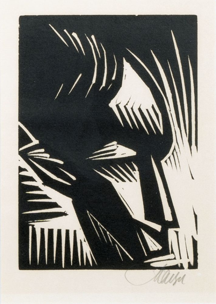
A linocut is a relief print made by cutting into a sheet of linoleum, rolling ink onto the raised surface that remains, and pressing that inked image onto paper or another support. In simple terms, the artist removes the parts they do not want to print. What is left raised receives the ink and creates the final image.
That basic structure puts linocut in the wider family of relief printmaking alongside woodcut and wood engraving. The difference is in the surface. Instead of cutting into wood, the artist cuts into linoleum. That change matters more than it may seem. Linoleum has no wood grain, so it allows for a smoother, freer and often more direct cut. It can be easier to carve clean shapes, curved lines and graphic forms. Many artists find it less resistant than wood and therefore more responsive to bold design.
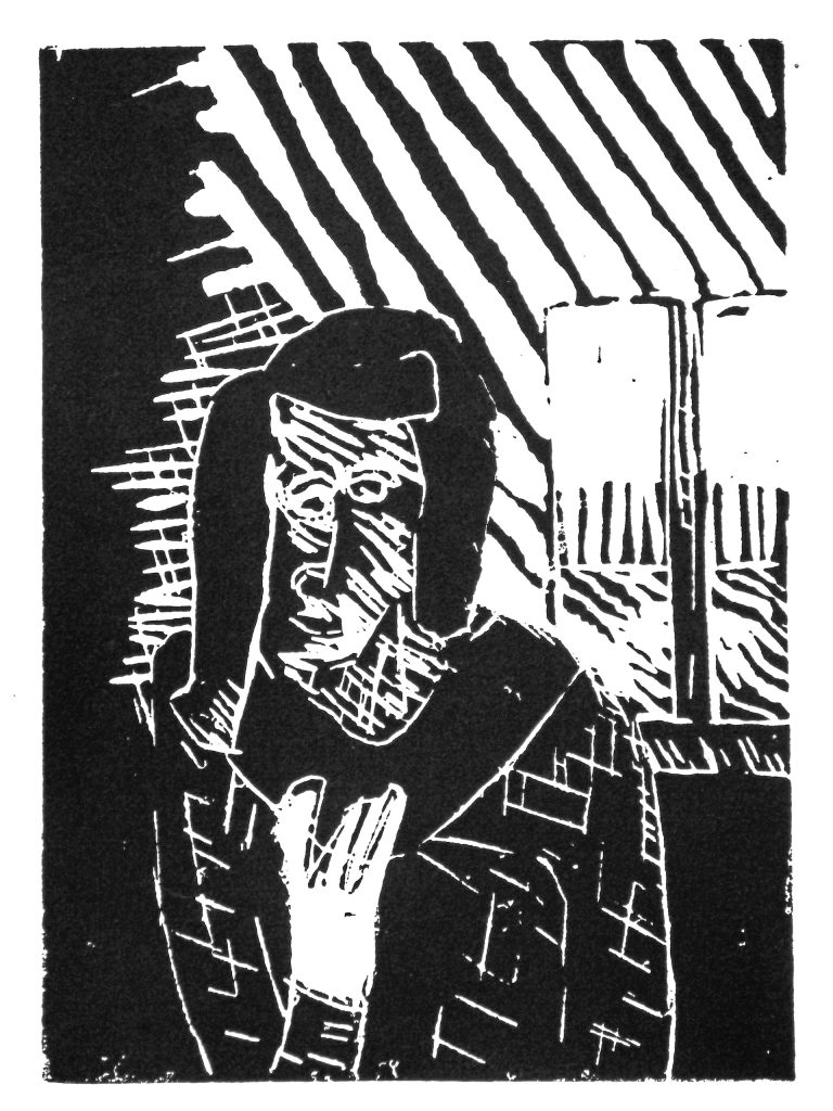
Linocut art is often characterised by flat, clearly defined areas of colour and strong contrast. That does not mean every lino print is simple, but it does mean the medium tends to reward clear design decisions. The artist has to think in terms of positive and negative space, what stays and what is cut away, how shapes lock together, and how the image will read once printed.
This is one reason linocut remains such a satisfying medium for both beginners and experienced artists. The process is straightforward enough to understand quickly, but it opens onto enormous visual variety. A lino print can be made with one colour or several, with one block or many, with rough expressive marks or carefully staged precision. The medium is disciplined, but not limiting.
Why linocut still feels so immediate
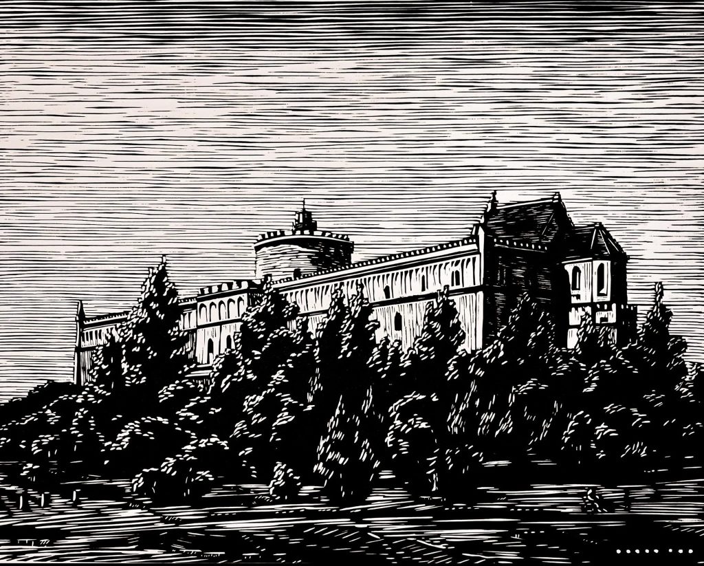
Linocut has a blunt honesty to it. The cut is visible. The image is built from decisions that cannot be endlessly softened or disguised. That gives lino prints a kind of visual confidence. Even when they are delicate, they rarely feel hesitant.
This quality matters now because contemporary visual culture is full of smooth, polished and easily adjusted images. Linocut resists that atmosphere. It is physical. It records pressure, carving, ink coverage and registration. It often carries tiny irregularities that make the print feel alive. The hand is not hidden, yet the work is not simply expressive in a loose painterly sense either. It is shaped through resistance. The artist has to commit.
That sense of commitment is part of what makes lino prints appealing to viewers. A good linocut often feels purposeful. The artist has simplified the image without draining it of life. What remains is structure. That structure gives lino prints their clarity and force.
Linocut also feels fresh because it sits comfortably between fine art, craft and design without becoming trapped by any one of them. It can appear in a museum context, a contemporary print fair, a book cover, a poster, a textile inspired composition or a framed work in a home. It has enough aesthetic bite to stand alone and enough accessibility to reach viewers quickly.
A short history of linocut art
Linoleum itself was invented in England in the nineteenth century as a floor covering. It was inexpensive, durable and widely used for practical domestic and public interiors. At first it was not an obvious fine art material. Over time, however, artists recognised that its smooth surface could work beautifully for relief printmaking.
Linocut became more visible as an art form in the early twentieth century, especially in Britain and Europe. One of the most important contexts for its development was the Grosvenor School of Modern Art in London during the 1920s and 1930s. Artists such as Sybil Andrews, Cyril Power and Claude Flight embraced linocut as a medium suited to modern life. It was inexpensive, direct and able to capture the rhythm, speed and pattern of the machine age.
That connection to modernity is important. Linocut was not only a substitute for woodcut. It became associated with a new visual language. Strong diagonals, repeated forms, moving crowds, transport, sport and industrial energy all found a natural home in colour linocut. The medium could simplify without feeling static. It could look mechanical and hand made at once.
Later, artists such as Pablo Picasso explored linocut in new ways, including the reduction method, which allowed complex colour images to be built from a single block cut and recut stage by stage. This showed how inventive the medium could be in the hands of a major artist who understood both its limits and its possibilities.
Linocut also developed strong regional and political histories outside Europe. In South Africa, for example, linocut gained particular importance because of its low cost, directness and bold graphic effect. The medium proved well suited to teaching, community practice and the communication of strong visual ideas. That history matters because it shows linocut was never only a niche fine art technique. It was also a democratic one.
How linocut works
The basic process of making a lino print is easy to describe, even if doing it well takes time.
The artist begins with a sheet of linoleum. A design is drawn onto the surface, either directly or transferred from another drawing. The artist then uses cutting tools to remove the areas that should remain white or unprinted. What stays raised is the part that will receive ink.
Once the block is cut, ink is rolled across the surface with a roller or brayer. The ink sits only on the raised areas. Paper is then placed over the block and pressure is applied, either by hand or with a press, so that the ink transfers to the paper.
The printed image appears reversed from the block. This means artists have to think carefully about direction, especially when using text or compositions where orientation matters.
That may sound mechanical, but in practice there are many decisions involved. How deep should the cut be? How sharp should edges remain? How much ink is enough? Should the image rely on crisp contrast or varied texture? How will the paper respond? Each stage affects the final print.
This is why lino prints can feel so distinctive. They are not merely copies of a carved surface. They are the result of a sequence of choices involving drawing, cutting, inking and printing, each of which leaves its mark on the finished work.
Why linocut looks the way it does
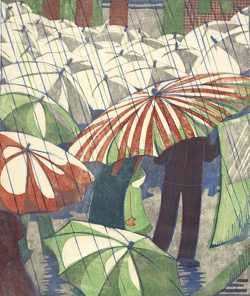
Linocut has a recognisable look because the process encourages certain visual strengths. It favours bold silhouettes, strong outlines, energetic marks, graphic contrast and well organised shapes. Even when a print is intricate, the medium tends to clarify rather than blur.
This is partly because of the cutting process. The artist has to decide what to remove and what to preserve. That creates a stronger relationship between positive and negative space than in many other mediums. Empty areas are never just empty. They are part of the design.
It is also because linocut tends to flatten the image in a useful way. Instead of relying heavily on subtle modelling or illusionistic depth, it often builds the picture through pattern, shape, contour and rhythm. That flatness is not a weakness. It is one of the reasons lino prints feel modern. They do not pretend to be windows onto another world. They declare themselves as printed images.
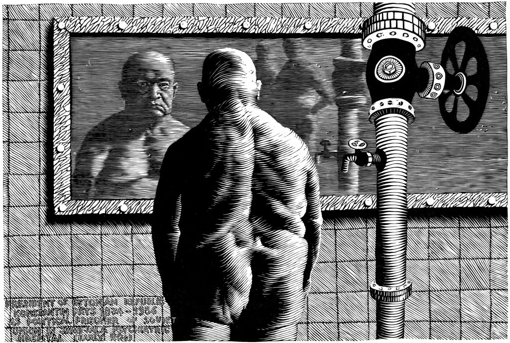
At the same time, lino does not force one visual formula. Some artists use broad, simplified cuts that produce poster like drama. Others use many small marks to create texture and tonal variation. Some artists lean into the slightly rough edge of the cut. Others pursue extraordinary precision. The medium has a shared logic, but not a single style.
Linocut versus woodcut
Linocut and woodcut are often discussed together because both are relief print techniques, but they do not feel exactly the same.
In woodcut, the artist cuts into a wooden block, and the grain of the wood becomes part of the process. That grain can give the image texture, resistance and direction. In linocut, the artist works on a sheet of linoleum, which has no grain. This usually makes the cutting feel smoother and the results more even.
Woodcut often retains a stronger sense of the material’s own character. The grain can become visible and active in the image. Linocut usually feels cleaner, flatter and more immediately graphic. Curved shapes and decisive outlines often come more naturally on lino than on wood.
Neither medium is better. They simply offer different qualities. Woodcut may feel rougher, older or more materially textured. Linocut may feel bolder, sharper or more modern in its graphic language. Many artists choose one over the other because it suits the image they want to build.
For viewers, understanding this difference helps because it changes how the print is read. A lino print may have a cleaner edge and stronger colour fields. A woodcut may carry more visible grain and a different kind of physical tension. Both belong to relief printing, but they speak with different voices.
Single colour linocuts and why black and white still works
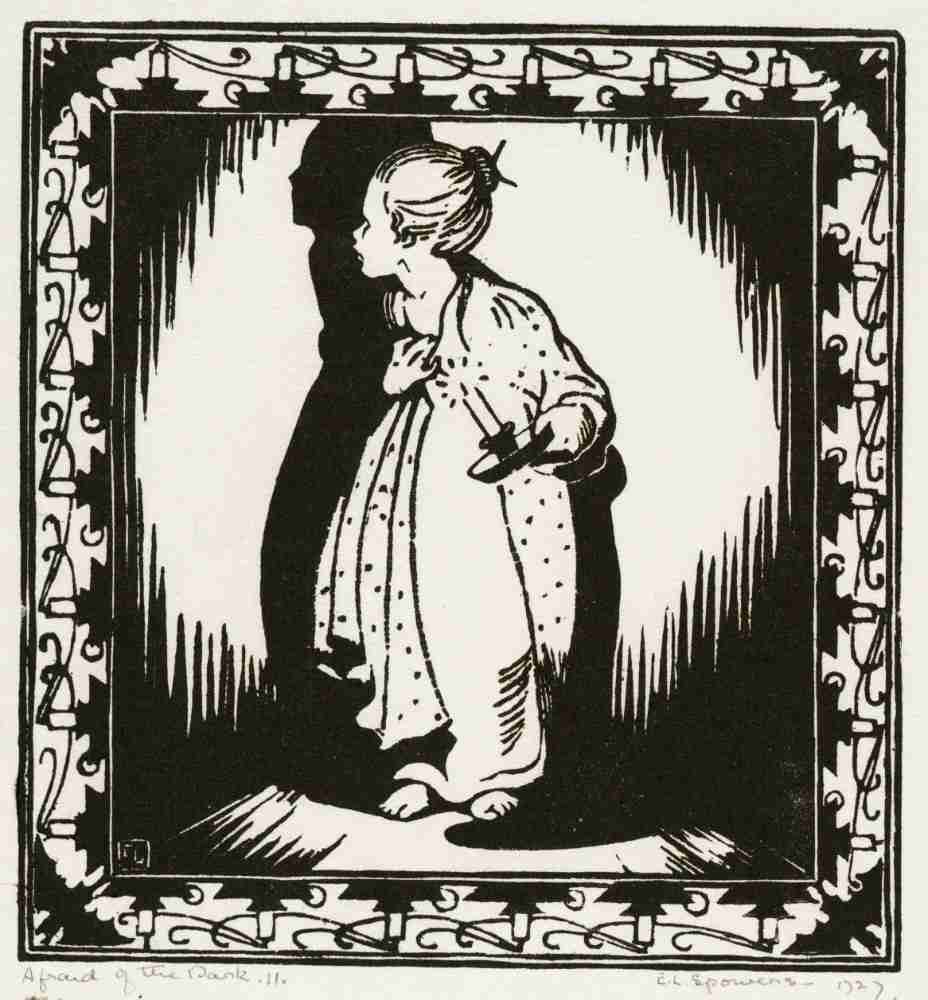
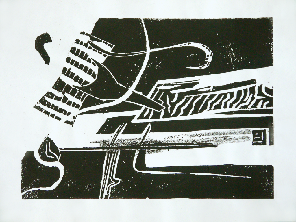
Many people first encounter linocut through black and white prints, and with good reason. The medium’s high contrast can be extremely powerful. A single colour print forces both artist and viewer to pay attention to structure, light, silhouette, pattern and rhythm.
Black and white linocuts often feel especially direct. They do not rely on colour to create interest. Everything depends on how the artist organises the image. This can make the results feel bold, dramatic and memorable.
It can also give lino prints a strong emotional edge. Black and white can heighten atmosphere, sharpen movement and create a sense of clarity that is difficult to achieve in more painterly mediums. Many artists continue to work in monochrome for exactly this reason. It keeps the image honest.
That said, black and white linocut is not automatically severe. It can be playful, elegant, decorative or lyrical depending on the design. The absence of colour simply shifts the pressure elsewhere.
Colour linocuts and the appeal of flat, vivid design
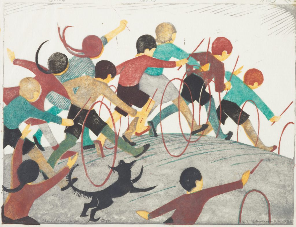
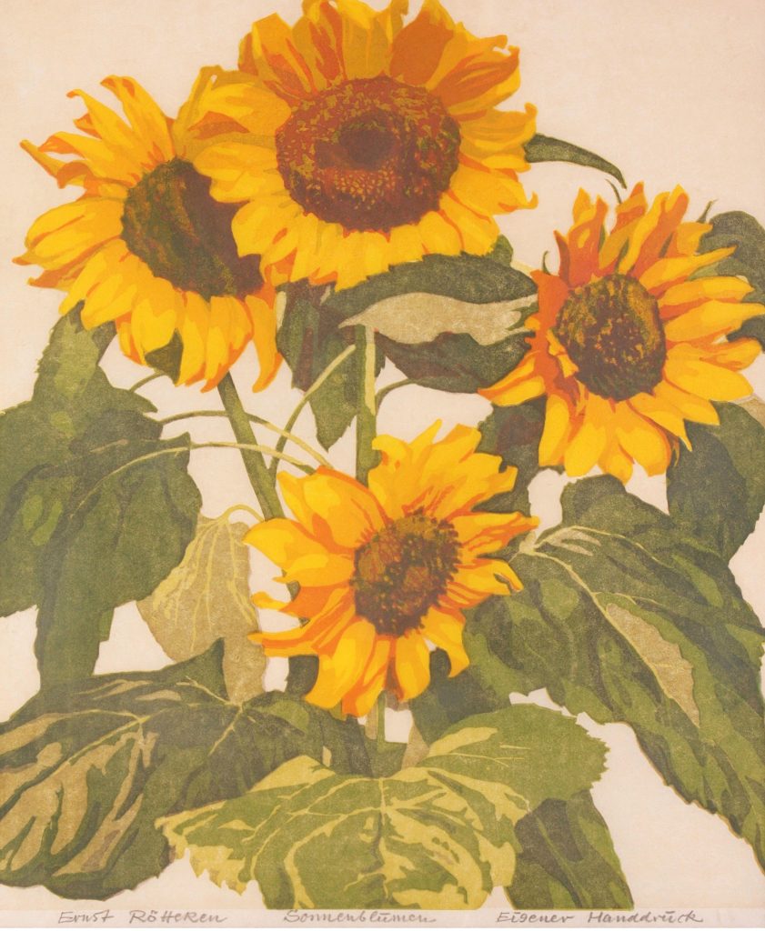
Colour linocuts have their own special charm. Because the medium handles flat colour so well, artists can build prints that feel lively, graphic and highly composed. Colour in lino prints often appears less blended and more structural than in painting. It works through blocks, layers and relationships rather than soft transitions.
This gives colour lino prints a visual brightness that can feel very fresh. Whether the palette is muted or vivid, it tends to read cleanly. Shapes lock together. Contrast becomes energetic. Repeated colours can create rhythm across the image.
Colour also helped establish linocut as a modern medium in the early twentieth century. The Grosvenor School artists, for example, used colour linocut to capture movement and urban life with exceptional energy. Sybil Andrews’s prints remain famous because they show how dynamic and contemporary the medium could be.
In colour linocut, planning becomes even more important. The artist has to decide how colours will layer, where shapes will sit and how the final print will hold together once all the blocks or stages are complete. That planning can be demanding, but it is also part of what makes the results so satisfying.
The reduction linocut and why it fascinates artists
One of the most admired forms of linocut is the reduction print, sometimes called a suicide print. In this method, the artist uses a single block for multiple colours. The block is cut, printed in one colour, cut again, printed in another colour, and so on until the image is complete.
This means the block is gradually destroyed as the process continues. Once areas are cut away for later stages, the earlier state cannot be recovered. The artist has to work with care and confidence because there is no going back.
This is part of why reduction linocut fascinates both artists and viewers. It carries risk. The final print feels earned because each stage depends on the last. Registration has to be accurate, colour choices matter and the block itself is sacrificed in the making.
Pablo Picasso’s linocuts are often mentioned in this context because his use of the reduction method helped demonstrate how rich and sophisticated lino printing could be. The medium was no longer only straightforward and graphic. It could also be inventive, layered and technically ambitious.
Why artists keep returning to linocut
Linocut stays relevant because it offers a rare combination of accessibility and artistic seriousness.
It is accessible because the basic process is easy to understand. You do not need a huge studio or highly specialised equipment to begin. The logic is straightforward. Draw, cut, ink, print.
It is serious because the medium rewards thoughtful design, patience and strong visual judgement. A lino print may look simple, but the best examples are carefully structured. They know exactly what to leave in and what to remove.
Artists also return to linocut because it encourages decisiveness. In a culture of endless adjustment and revision, lino asks for commitment. Once a cut is made, it changes the block. That pressure can be creatively useful. It pushes the artist towards clarity.
Another reason is that linocut holds a productive balance between repetition and variation. Because it is printmaking, an image can exist in multiple impressions. But each impression can still carry slight differences of ink, pressure and paper. This makes the print edition both repeatable and alive.
Linocut also suits a wide range of subject matter. Landscapes, birds, city scenes, interior views, portraits, folk imagery, typography, botanical studies, abstraction and narrative sequences can all thrive in the medium. It is one of the reasons lino continues to appear in both fine art and design adjacent contexts.
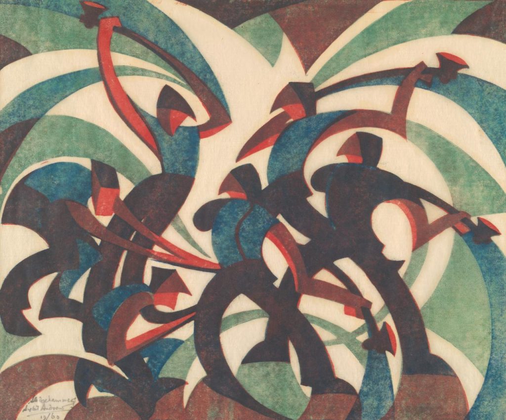
Felton Bequest, 1937
© Estate of Sybil Andrews, Glenbow, Calgary, Canada
Famous linocut artists to know
If you want to understand the history and appeal of linocut art, a few artists are especially worth knowing.
Sybil Andrews is one of the major names in British linocut. Her colour prints of sport, labour and movement remain some of the clearest examples of how energetic and modern the medium could become. Her work is a perfect introduction to the Grosvenor School approach.
Cyril Power is another important British figure. His prints use strong diagonals, repeated forms and controlled colour to create a sense of pace and motion. He helps show how linocut was tied to the visual culture of modern life.
Claude Flight matters not only as an artist but as a promoter of colour linocut. His teaching and advocacy helped shape the medium’s development in Britain during the interwar years.
Edward Bawden is essential if you want to see how lino can be both graphic and witty. His prints often combine observation, decorative intelligence and a distinctive sense of British place and humour.
Pablo Picasso is an important figure for the later history of linocut because of his technical experimentation, especially with reduction methods. His work helped demonstrate how sophisticated the medium could be in the hands of an already established master.
Outside Europe, the South African history of linocut is especially important. MoMA’s material on Rorke’s Drift and beyond points to a strong contemporary and historical practice shaped by directness, cost, accessibility and bold visual language. This broadens the story of linocut far beyond one British or European tradition.
Why linocut feels contemporary now
Linocut feels contemporary now for some of the same reasons that letterpress, ceramics, weaving and other materially clear practices feel relevant. It offers a slower, more deliberate relation to image making.
That does not mean it is nostalgic. Good lino prints do not simply imitate the past. What makes them contemporary is the way they bring sharp design, hand made process and strong visual editing into the present.
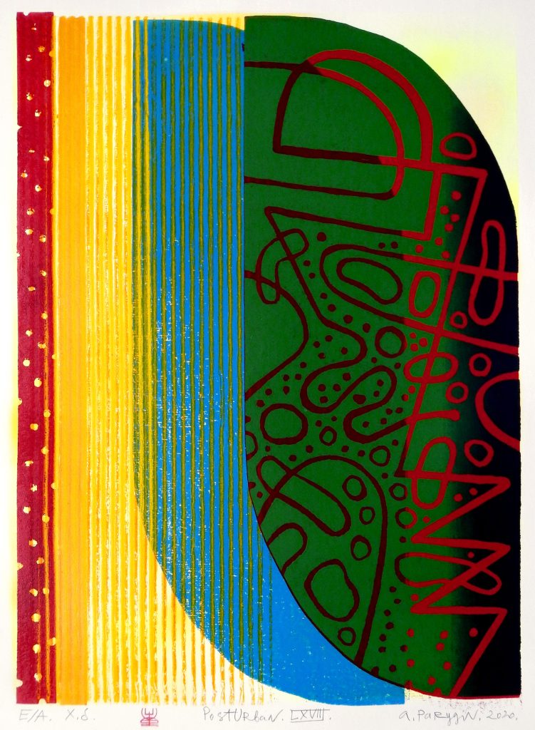
The medium also fits current taste surprisingly well. Interiors, publishing, gallery retail and independent art spaces often favour work that feels graphic, thoughtful and physically made. Linocut meets all of those conditions. It can be editioned, collected, framed and lived with. It often feels both affordable and artistically serious.
There is also a deeper reason it still feels fresh. Linocut simplifies without becoming empty. It reduces an image to essentials while keeping its energy. In a crowded visual environment, that clarity is attractive.
Many viewers respond strongly to lino prints because the work looks resolved. The artist has already done the hard work of editing. What remains is concentrated.
How to look at a linocut properly
If you want to get more from linocut art in a gallery or print fair, there are a few things worth paying attention to.
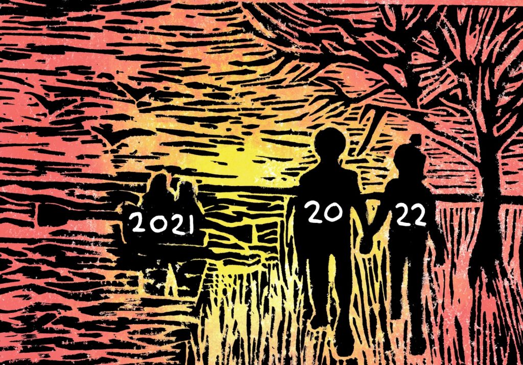
First, look at the cut marks. Are they broad and open, or fine and intricate? The character of the cut tells you a great deal about the artist’s approach.
Second, notice the relationship between positive and negative space. Relief printmaking often depends on this more strongly than painting does. White areas are not blank. They are part of the image’s architecture.
Third, look at the ink. Is it evenly rolled, or does it carry slight variation? These differences can affect the liveliness of the print.
Fourth, if the print uses colour, think about how the colours are built. Are they flat and separate? Overprinted? Slightly misregistered? These decisions are part of the print’s character.
Fifth, remember that a lino print is both an image and an impression. It comes from a carved block, but it lives on paper. The quality of the paper, the pressure of the print and the scale of the sheet all matter.
Lastly, think about why the artist chose linocut rather than another medium. What does the process add? Does the subject benefit from bold contrast, simplified forms, repeated pattern or graphic energy? In good printmaking, the medium is never accidental.
Linocut art and framing
Linocuts are particularly rewarding to frame well because framing can either support or flatten their visual strength. A strong lino print often benefits from enough breathing room around the image so that the cut and printed surface have space to work. Overly heavy framing can sometimes compete with the graphic force of the print, while a well judged frame can sharpen it.
Paper based works also need sensible protection. If a linocut is an original print rather than a reproduction, framing choices matter both visually and practically. Mounting, glazing and light exposure all affect how the work lives over time.
This is one reason printmaking and framing belong together more naturally than people sometimes realise. A lino print is not just an image to be displayed. It is a paper object with surface, edge and material presence. A good frame respects that.
Common misconceptions about linocut art
It is just a beginner medium
Linocut is accessible, but that does not make it basic. Major twentieth century artists used it seriously, and the best contemporary lino prints require real skill, planning and visual intelligence.
It is always black and white
Many lino prints are monochrome, but colour linocuts are a major part of the medium’s history. Reduction methods and multi block printing can produce rich and complex colour images.
It is the same as woodcut
Both are relief prints, but they behave differently. Linocut usually feels smoother and more graphic, while woodcut often retains a stronger sense of grain and material texture.
It is too graphic to be subtle
Not true. Linocut can be bold, but it can also be delicate, atmospheric and nuanced. Subtlety in lino often comes through structure, rhythm and tone rather than soft modelling.
Why linocut art still matters
Linocut art still matters because it offers something rare. It is direct without being crude, accessible without being shallow, and graphic without losing depth.
It reminds viewers that strong images do not need endless complexity. They need thought, editing and conviction. Linocut strips an image back to what matters and in doing so often makes it stronger.
The medium also matters because it keeps alive a relationship between hand, tool, surface and print that still feels meaningful. In a digital world where images can be endlessly adjusted and circulated, lino printing retains a different kind of authority. It carries the evidence of making.
For artists, linocut remains a medium of real possibility. It can support experimentation, clarity, humour, political force, decorative invention and formal discipline. For viewers, it offers works that are often immediately engaging but capable of lasting attention.
That combination helps explain why lino prints continue to appear in galleries, studios, fairs and homes with such success. They meet people quickly, but they do not finish there.
Linocut art endures because it combines clarity, force and physical process in a way few mediums can. It belongs to the history of modern printmaking, but it also feels entirely at home in the present. Its bold shapes, crisp contrasts and hand cut energy continue to attract artists and viewers who want images with real structure and life.
What makes linocut still feel fresh is not novelty. It is the opposite. It is the medium’s refusal to hide behind excess. A lino print has to work through design, cut, ink and pressure. The image has to earn its impact.
That is why the best linocuts remain so memorable. They look edited, deliberate and alive. They remind us that printmaking can be both disciplined and inventive, and that boldness in art does not have to mean loudness. Sometimes it means making the right cuts and letting the image speak clearly.
The next time you see a lino print, whether in a gallery, print fair, studio wall or framed at home, take a moment to look beyond the surface boldness. Notice the shapes, the white space, the texture of the cut and the confidence of the design. Very often, that is where the freshness of linocut art still lives.
Leave a Reply